Smash Me, Baby! is a burger spot in LA with a name that does the work of a tagline before you've even seen the menu. The brand had to land the tongue-in-cheek tone without tipping into kitsch — and every touchpoint had to be Instagrammable, because reach was the whole strategy.
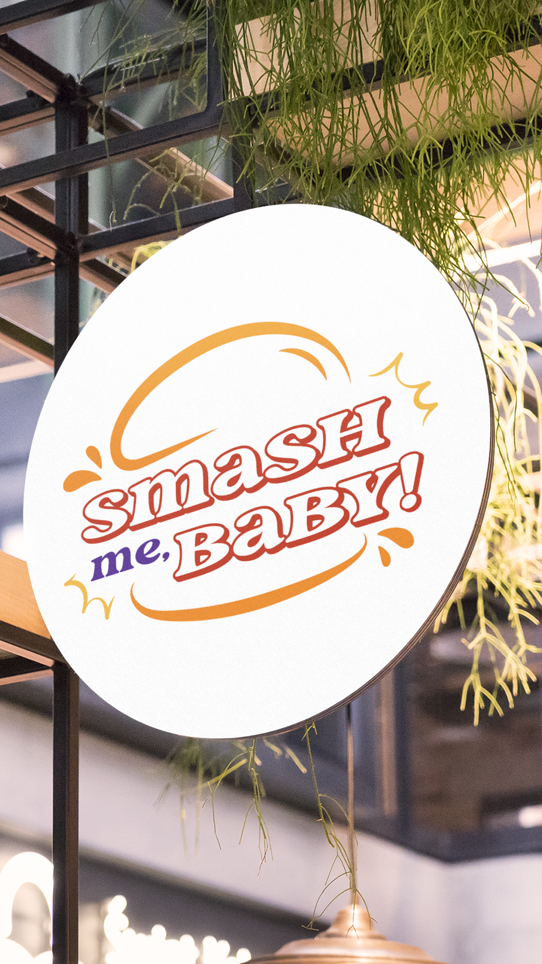
We built a visual identity that refuses the smash-burger category playbook. No moody butcher-shop palette. No minimalist black-and-white restraint. No "we take our burgers seriously" posture. The whole system runs on pop-comic energy, more like a vintage roadside billboard than a fast-casual restaurant.
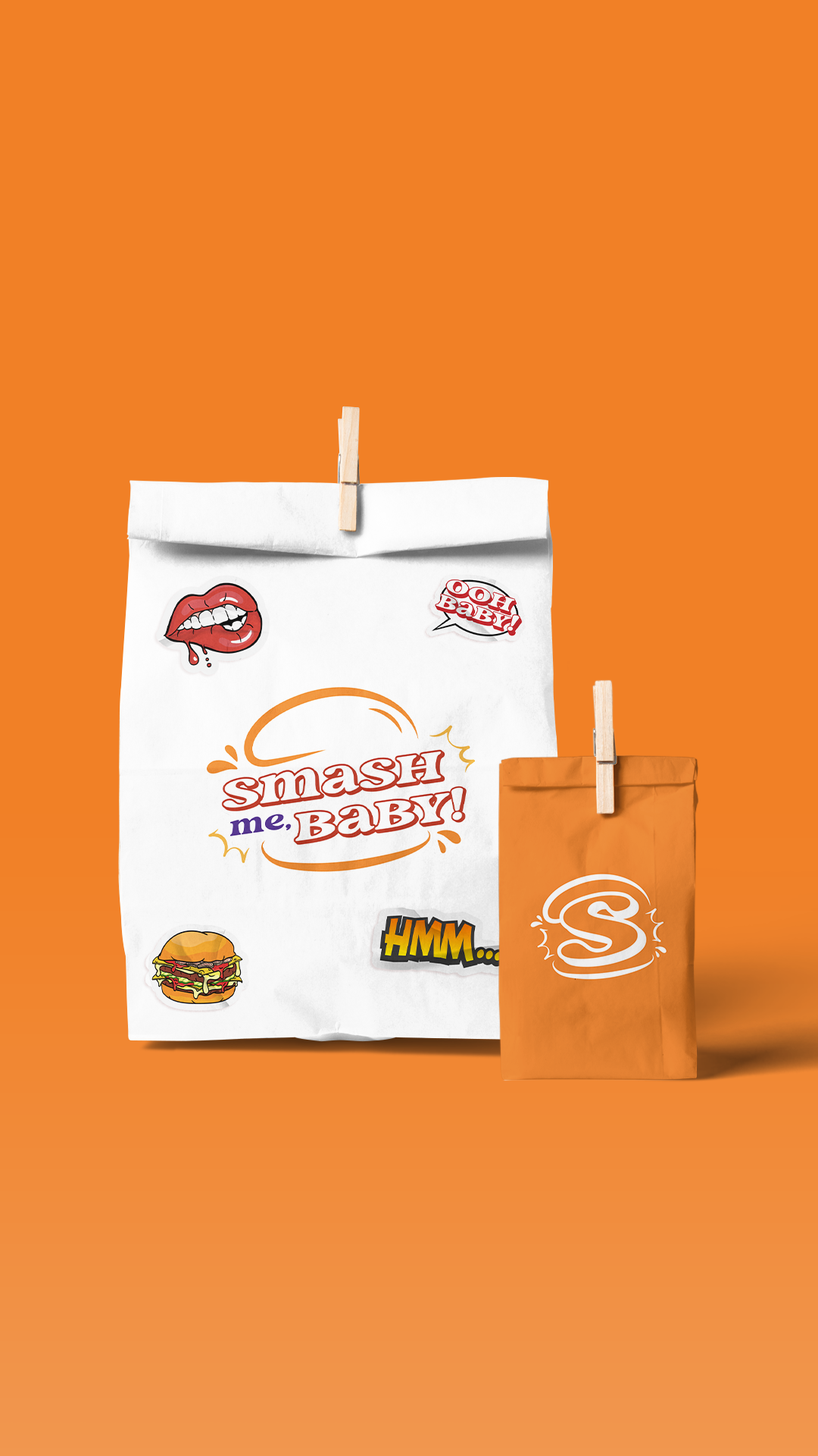
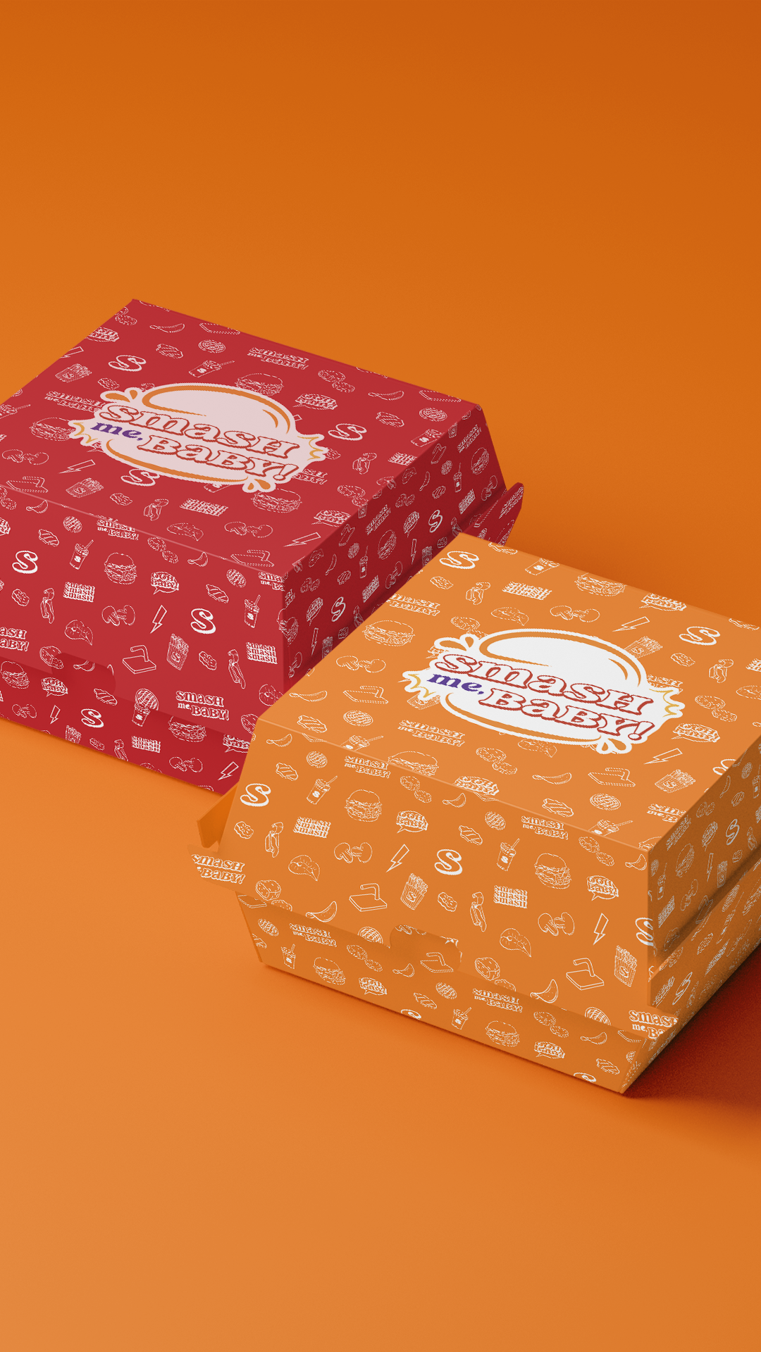
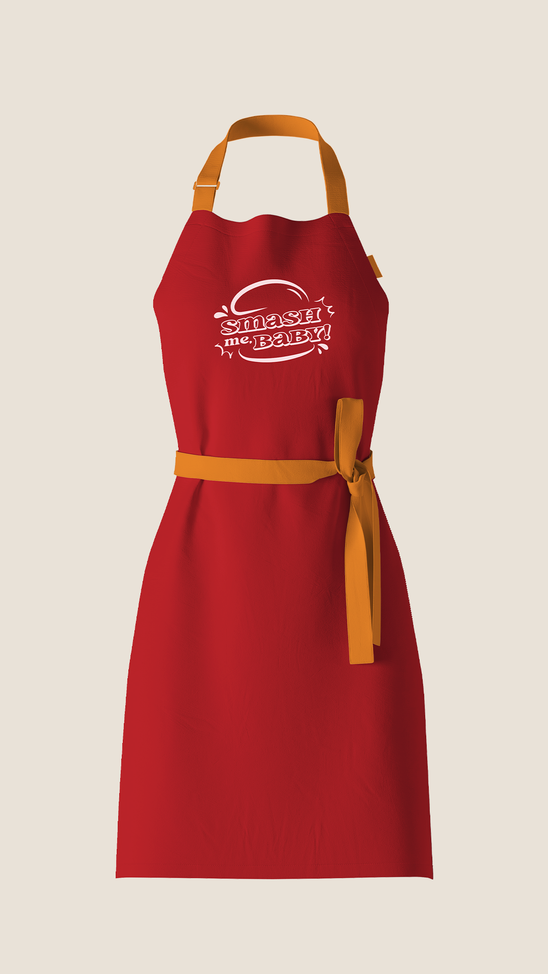
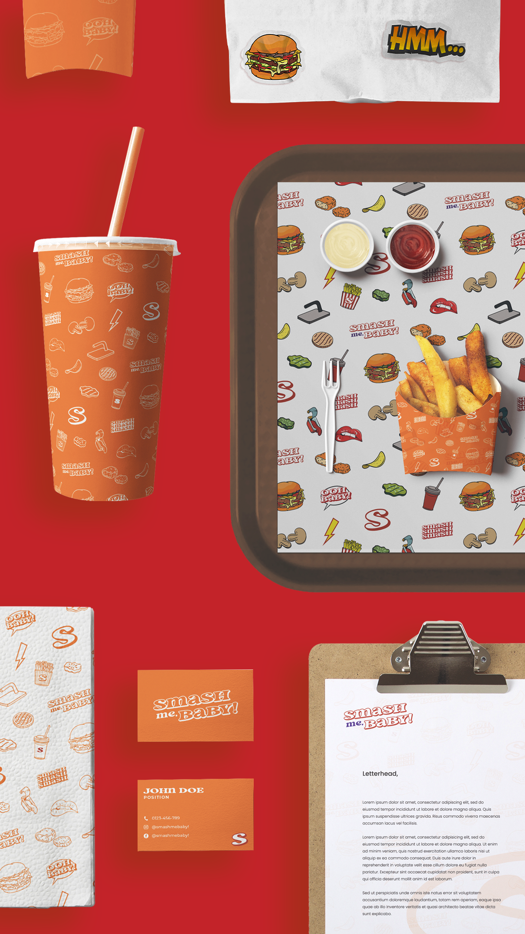
The wordmark leans retro with a flirty curl, anchored by an orange-red-purple palette built to read loud from across the parking lot — and louder on a phone screen. Sticker-style call-outs — lips, "OOH BABY!", "HMM…" — turn the takeout bag into a prop. Pattern packaging covered in line-drawn burgers, fries, and lightning bolts gives every surface the texture of a comic panel, so there's no bad angle on the table.
Every touchpoint is engineered to get posted. The brand earns its reach the second a customer pulls out their phone.