Scout is a real estate brand built for pro athletes and their families relocating between markets. Pro athletes spend their entire careers inside elite brand systems — team marks, league credentials, performance gear. Scout had to clear that bar.
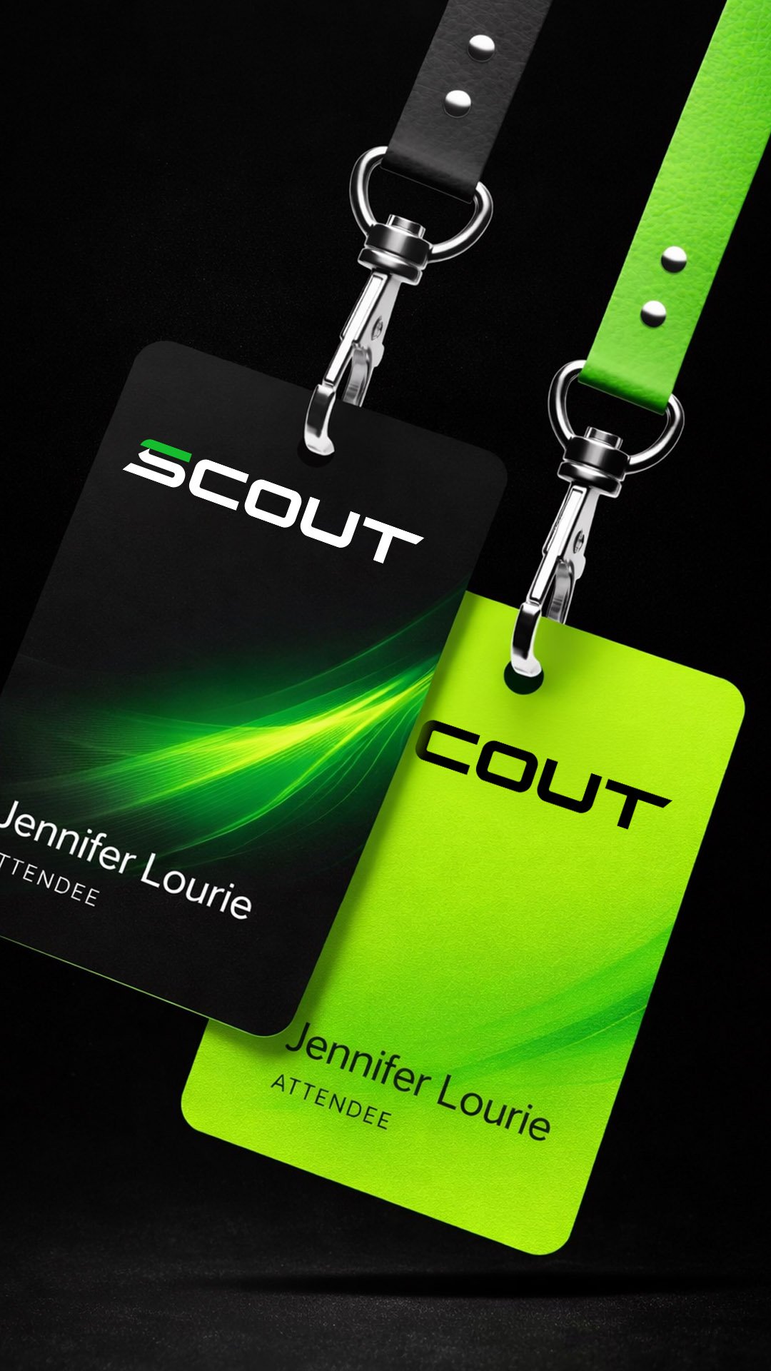
We built a visual identity that refuses the residential real estate playbook. No tasteful neutrals. No script logos. No "luxury living" gold-and-beige restraint. The whole system reads more like a team brand kit — closer to sideline credentials and stadium signage than open-house yard signs.
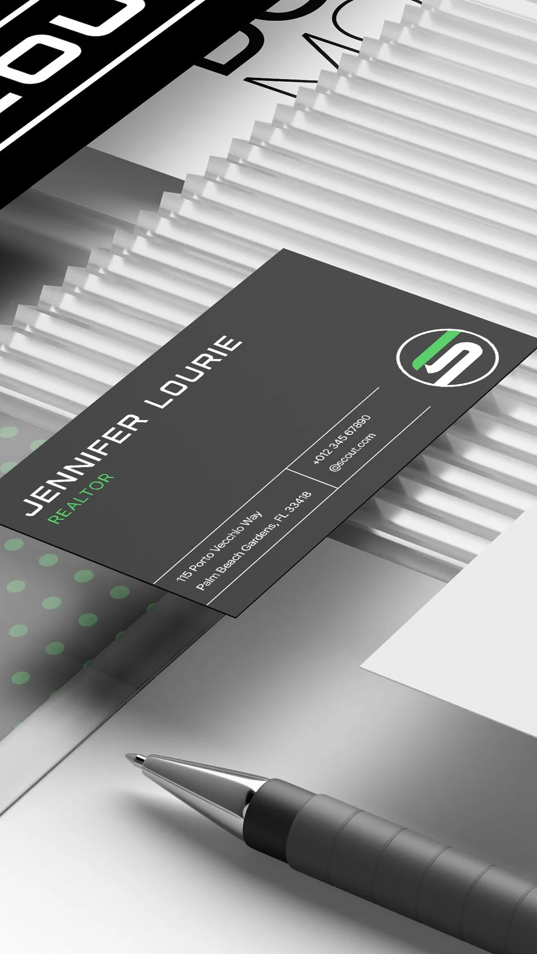
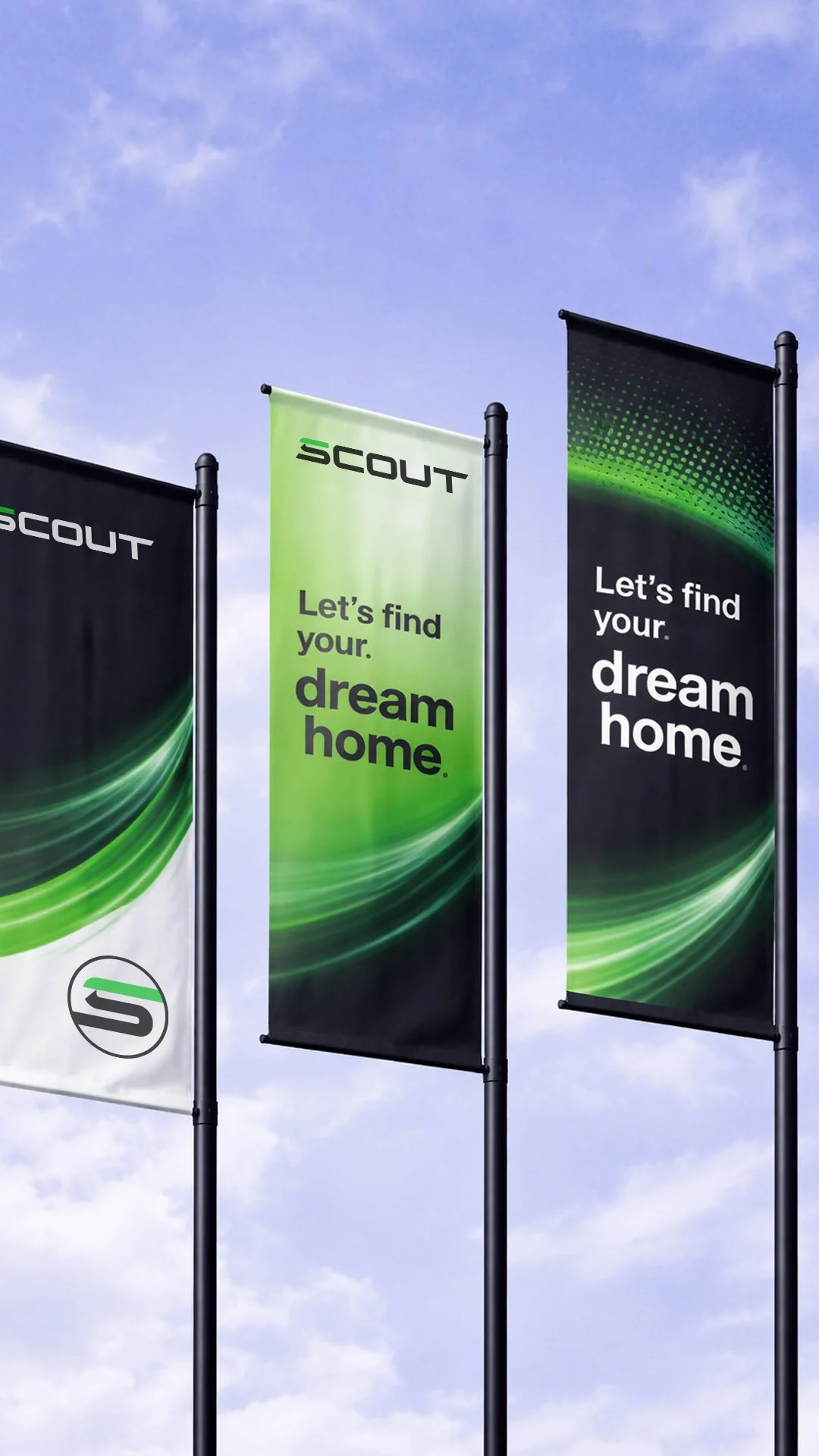
The wordmark is a bold athletic sans with a green accent slicing through the "S," paired with a circular monogram that could pass for a league mark. The neon-green-on-black palette borrows from performance gear, and the motion streaks running through every layout pull speed and direction into a category that usually sits still. Lanyards, banners, business cards — every touchpoint is sized and styled for an audience that's spent their career inside well-built brand systems.
Every touchpoint signals what these clients clock the second they see it: this is the difference between a transaction and a team in your corner.