Lily Billings sells real estate in Silicon Valley's Mid-Peninsula — Atherton, Menlo Park, Palo Alto, Redwood City — a market built on tech money, tech timelines, and tech aesthetics. Lily's whole positioning is the opposite: a people-first advocate who slows the process down enough to actually serve her clients. The brand had to feel like the antidote, not the algorithm.
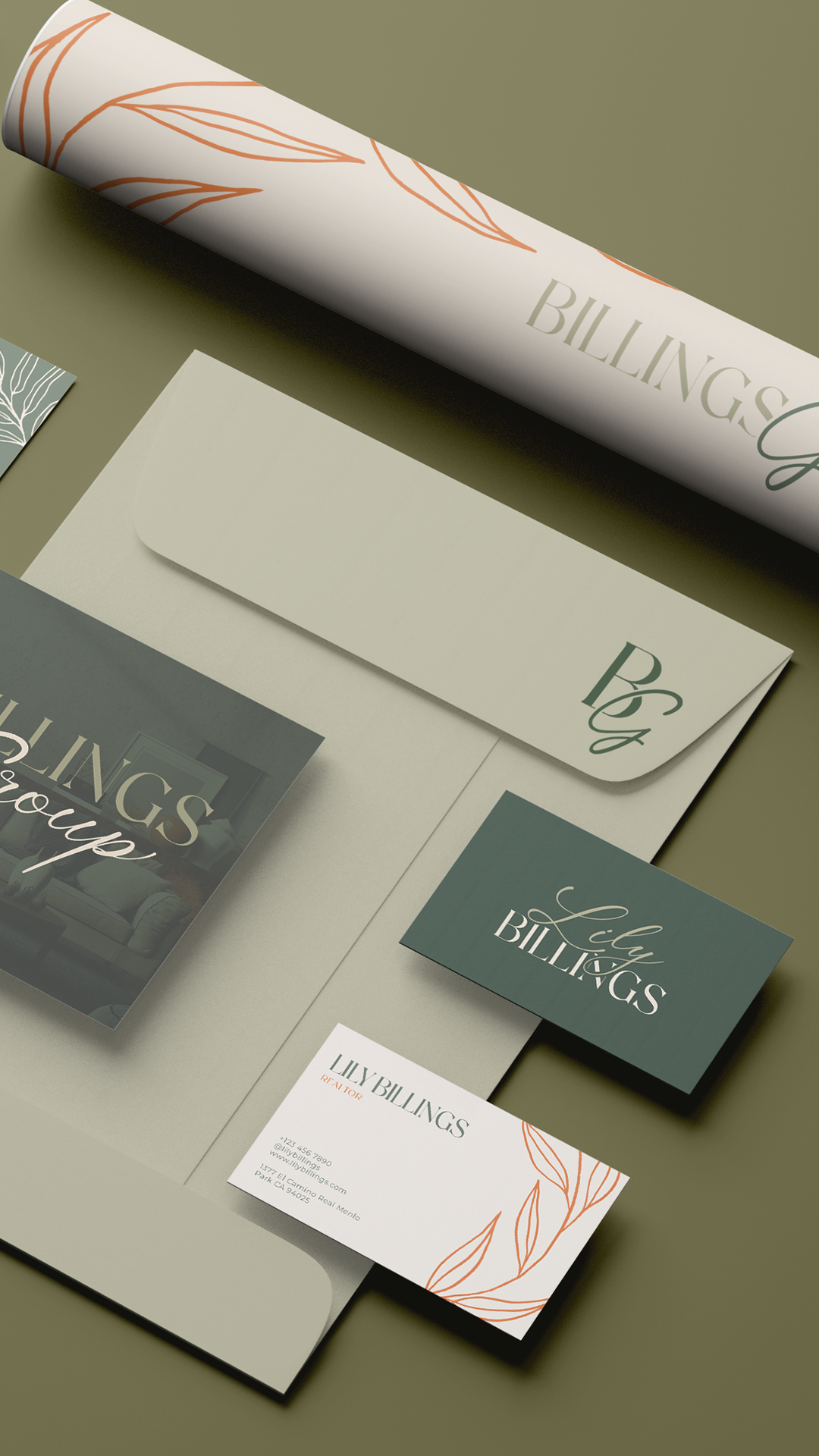
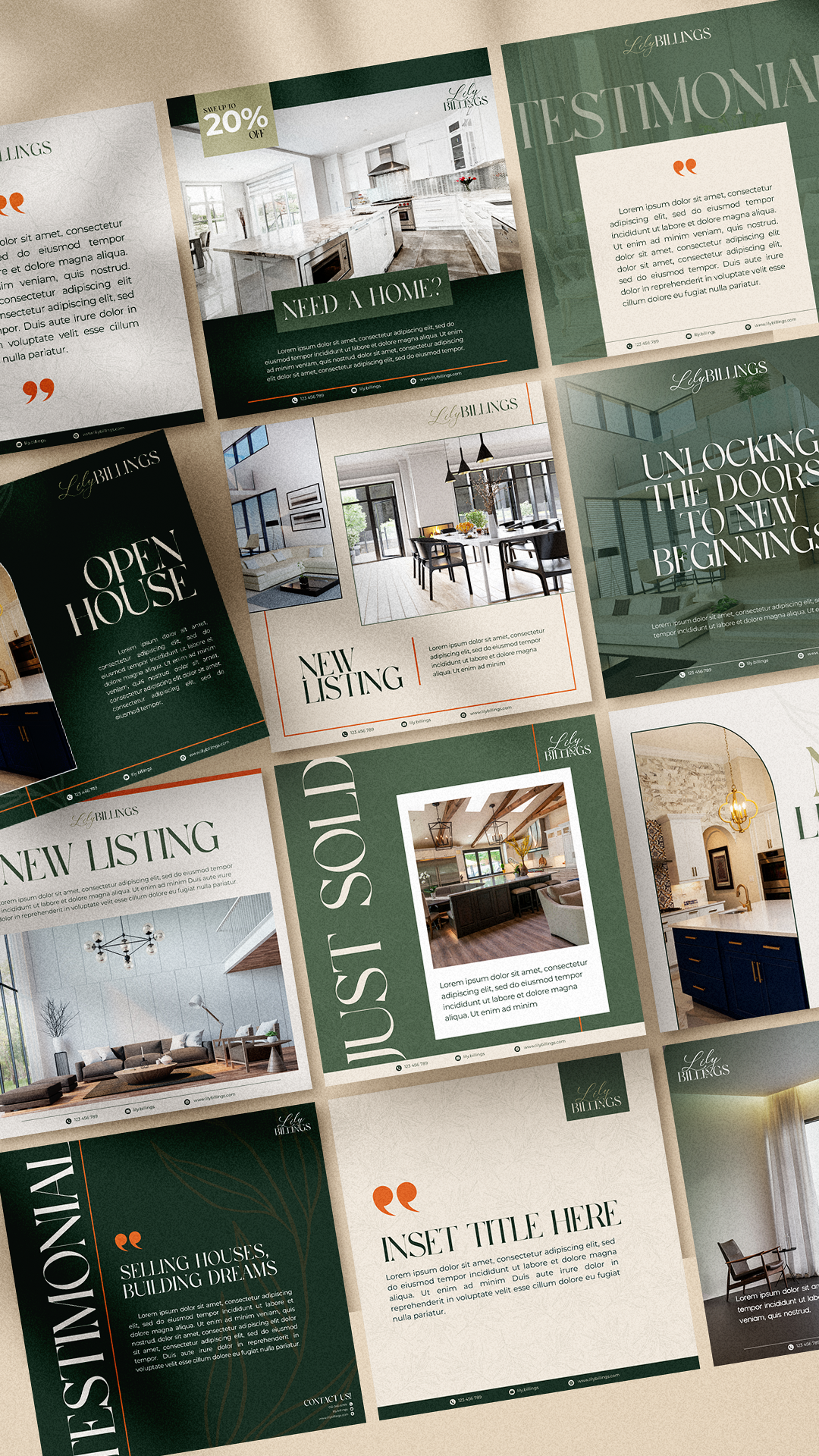
We built a visual identity that refuses the Bay Area real estate playbook. No sleek tech-modern minimalism. No glass-and-steel coldness. No generic Compass-agent restraint. The whole system reads more like an editorial garden journal than a luxury listing — closer to a thoughtfully designed stationery suite than a real estate flyer.
A sage-green-and-cream palette warmed with terracotta accents anchors the system, with botanical line drawings carrying organic energy across every surface. The BG monogram sits inside a refined emblem — confident enough to hold its own, soft enough to feel approachable. A serif "LILY BILLINGS" wordmark pairs with a script "Billings Group" lockup to balance the personal and the professional: one feels like a signature, the other like a stamp.
Every touchpoint reinforces what her clients feel the first time they meet her: this is what real estate looks like in Silicon Valley when the person comes first.
Ask
Legacy Model