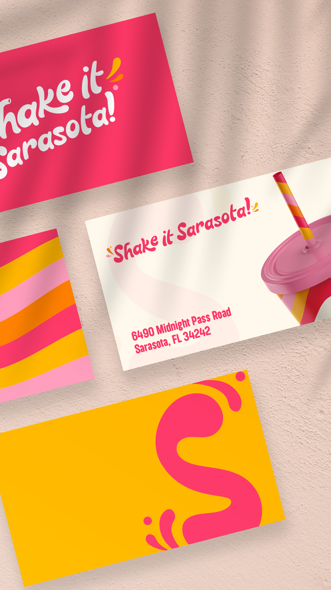
Shake It Sarasota sells milkshakes on Siesta Key, one of the best beaches in the country. The brief was the opposite of every other brand we've built. Stop being precious. Be fun.
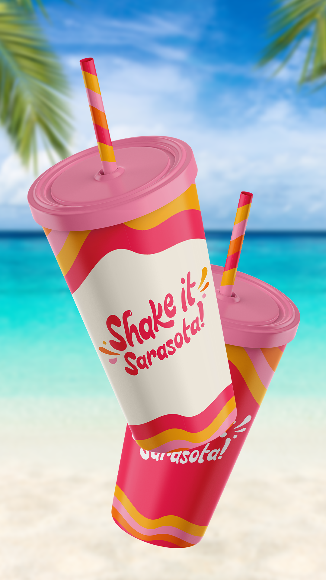
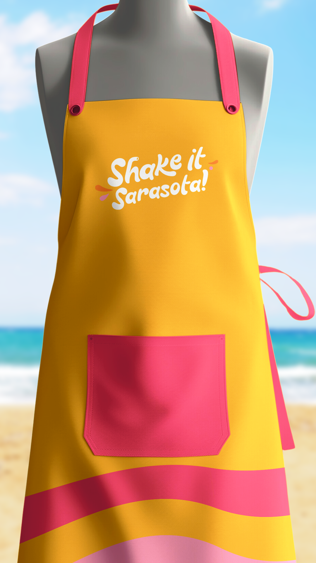
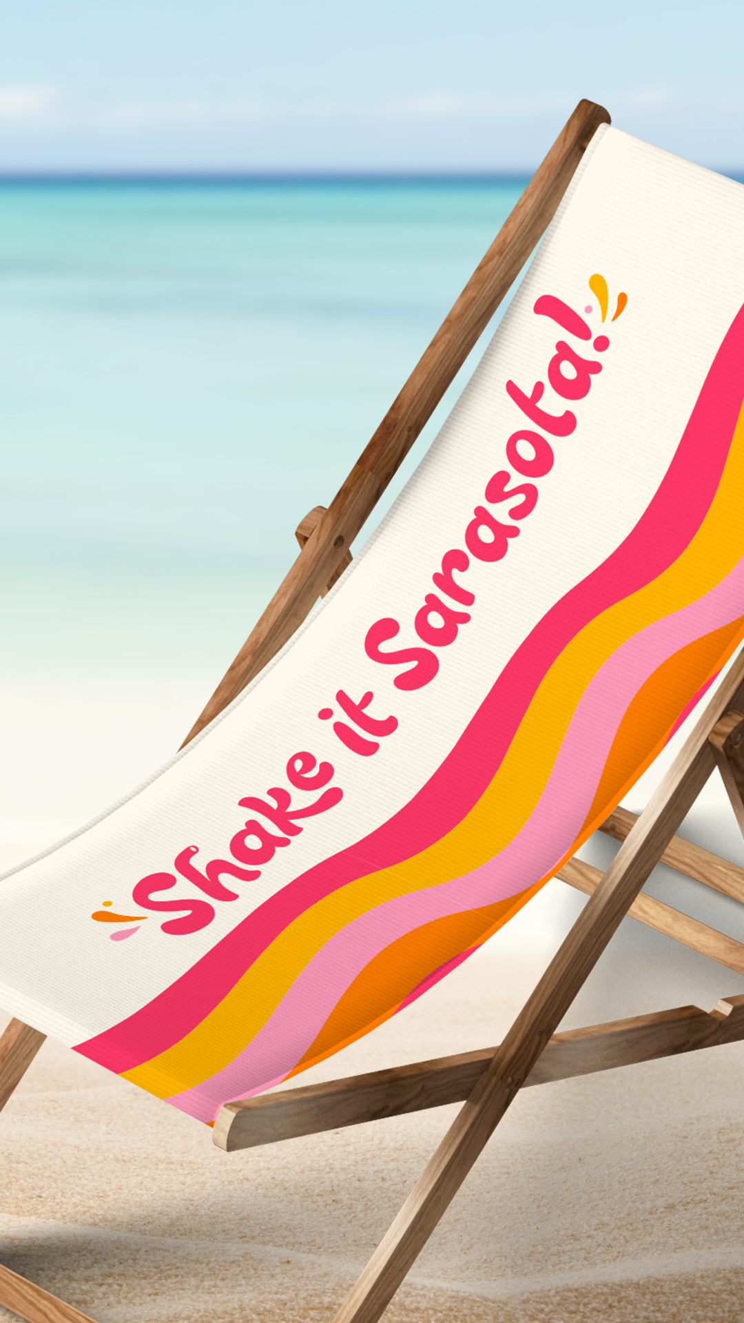
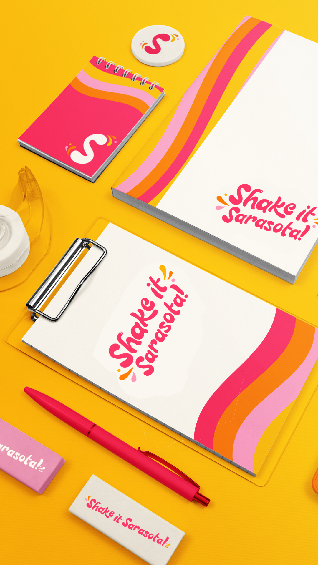
We threw out our usual playbook on restraint. No muted neutrals. No refined serifs. No "elevated" anything. The palette pulls from a Florida sunset — hot pink, citrus orange, sun-bleached yellow — laid down in waves that ripple across the brand like soft serve catching the light. The logo is hand-lettered with splashes and bursts that move the way the drink does when you shake it, more like a sign someone in a yellow apron painted than a typeface from a foundry.
The system was built for the surfaces a beach business actually uses. Cups, straws, signage, beach chairs, the side of a 32-ounce tumbler somebody's holding on a Tuesday at noon. Every asset stays loud at distance and warm up close — visible from the parking lot, friendly across the counter.
Every touchpoint reinforces what the customer already feels walking in the door. This place is fun. This place is theirs. The shake is about to be the best part of their day.