Mollie Noe sells in Ponte Vedra Beach, one of Florida's quieter luxury markets. Gated coastal communities. TPC Sawgrass down the road. Buyers who pick the northeast Florida coast precisely because it isn't Miami. Her brand had to match the place, not the cliché of the place.
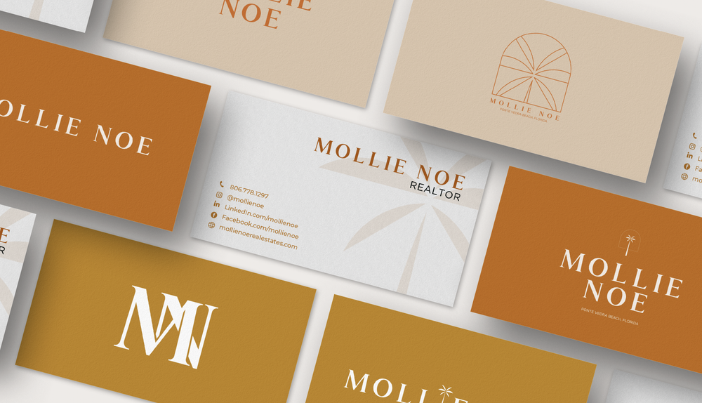
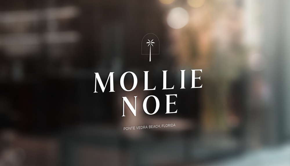
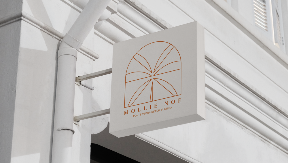
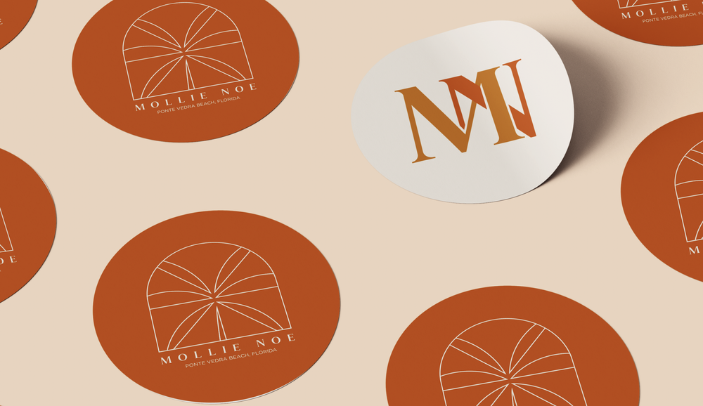
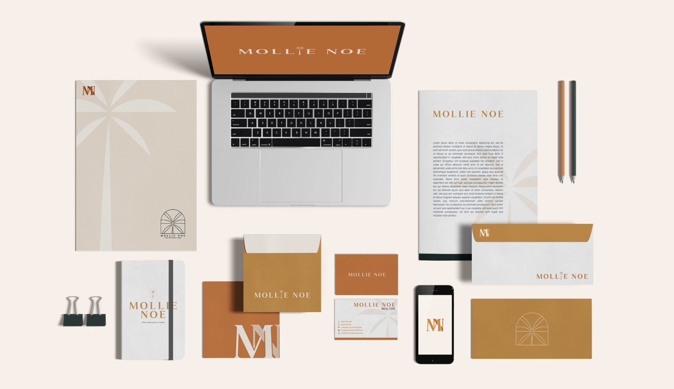
We built a visual identity that refuses the standard Florida realtor toolkit. No turquoise. No flip-flops. No palm-tree-and-sunset photography. The palette pulls from terracotta and warm cream, the actual colors of the architecture her clients are buying into. The palm tree mark is rendered as a simple line drawing, more like a window etching than a postcard. A stylized archway references the Mediterranean Revival architecture that runs from St. Augustine through Ponte Vedra without being literal about it.
The MN monogram is elegant and italic, the kind of mark that reads like personal stationery instead of a real estate logo. The refined serif typography reads quiet, not luxe. The whole brand feels like a salt-air morning before the day catches up to you, which is what Ponte Vedra Beach actually is, not what Florida branding usually sells.
Every touchpoint reinforces what Mollie's clients are actually looking for: Florida done with restraint, sold by someone who gets the difference.