Theoni built the brand on TikTok before we ever touched a single visual. 269K followers worth of rants, big-bank takedowns, and "mortgages, but make it simple" — her voice was the brand long before the brand had a logo. Our job was to design an identity that could keep up.
The voice was anti-establishment by design. Theoni serves the clients big banks underwrite badly: creators, influencers, the self-employed, the people whose income doesn't show up on a W-2 the way a Wells Fargo loan officer wants it to. Not Ur Daddys names what the brand isn't — corporate, conservative, condescending — so it doesn't have to spend energy explaining what it is.
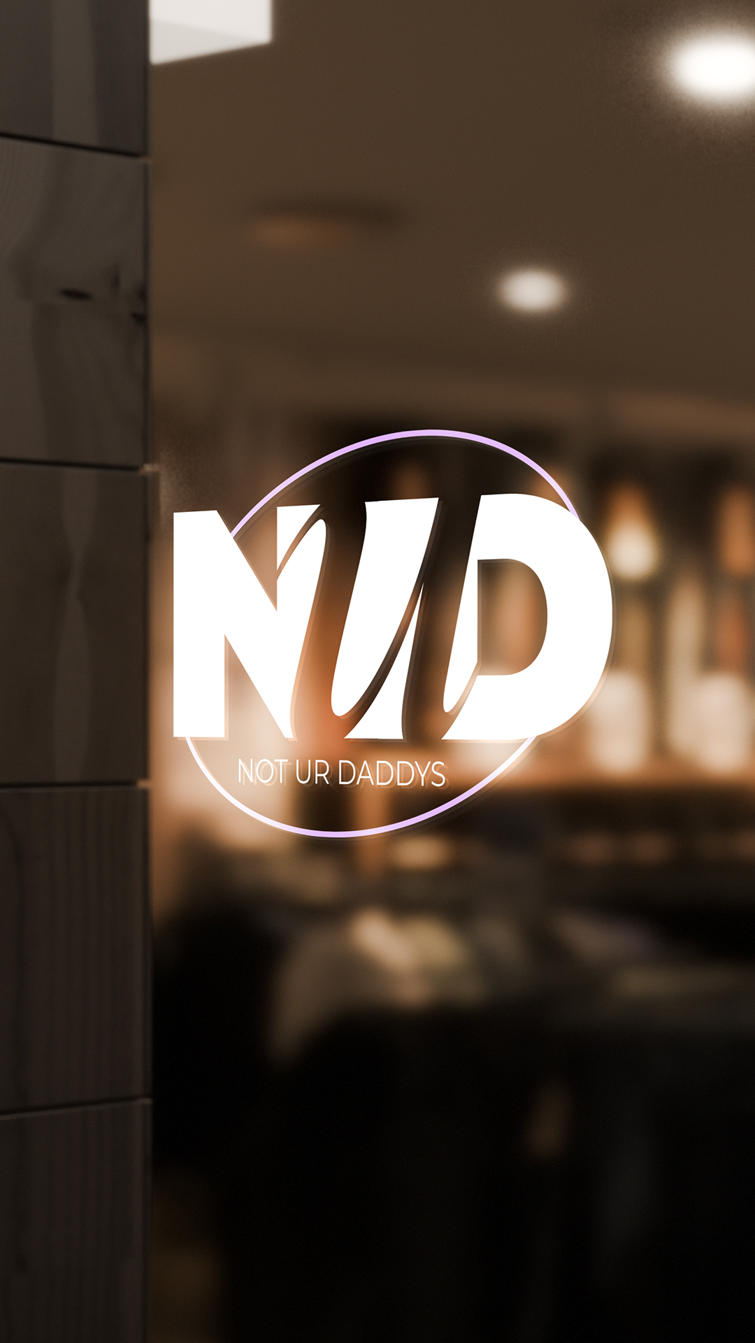
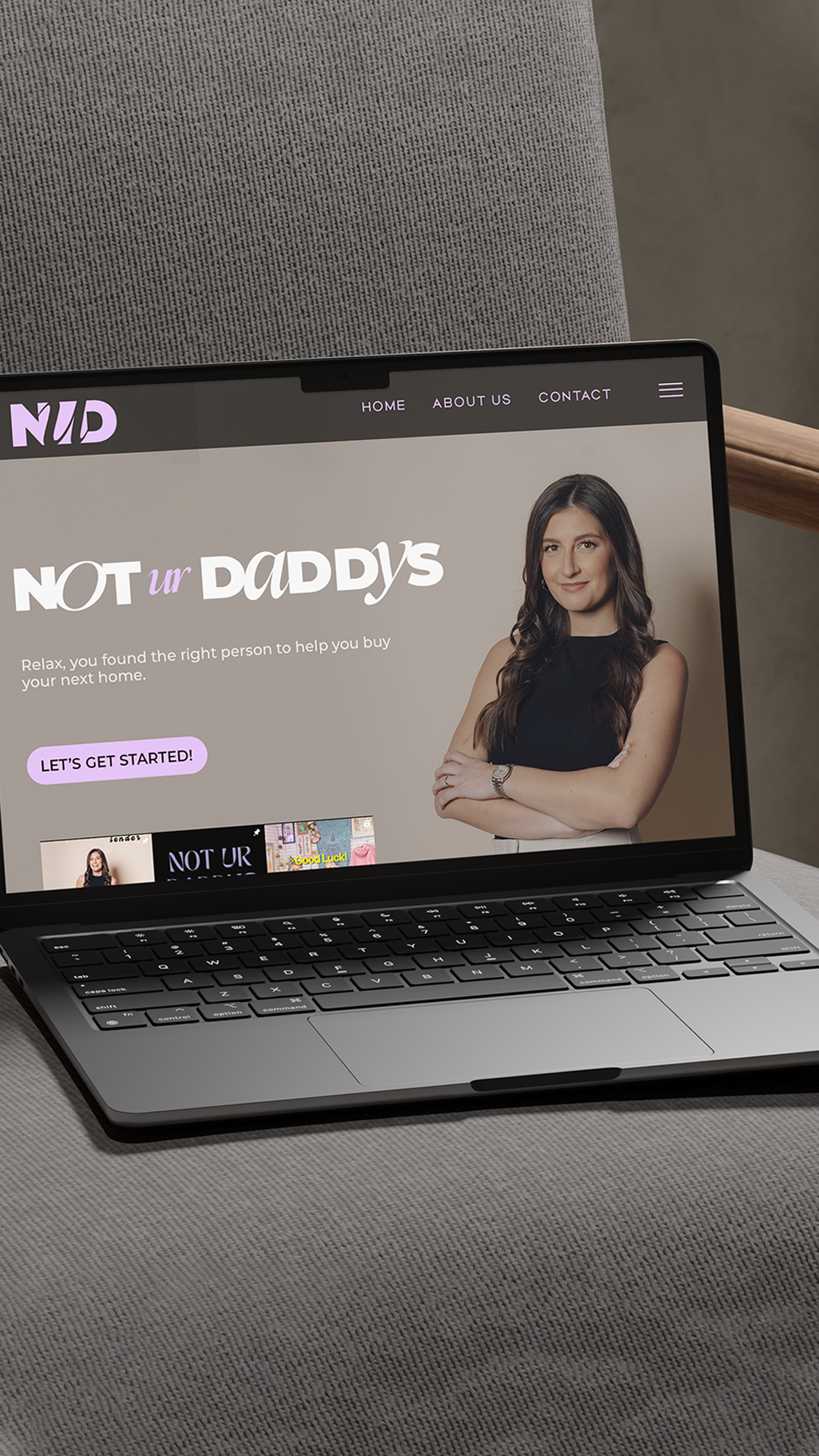
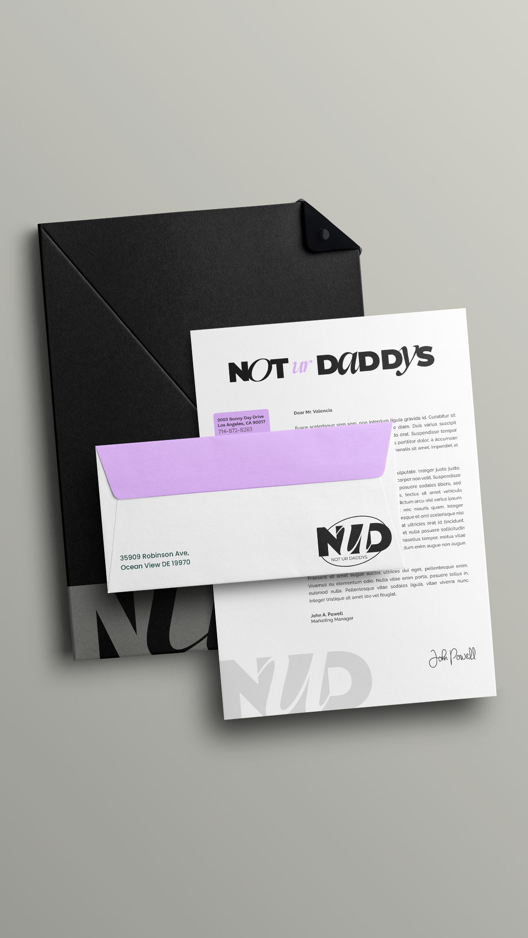
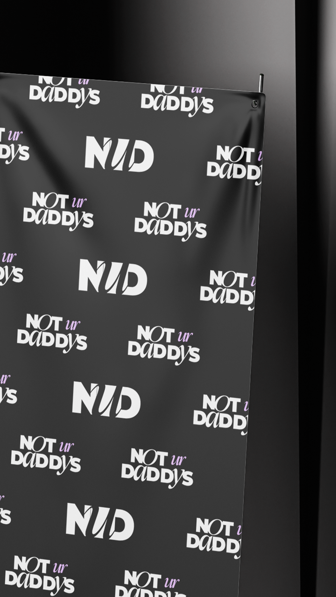
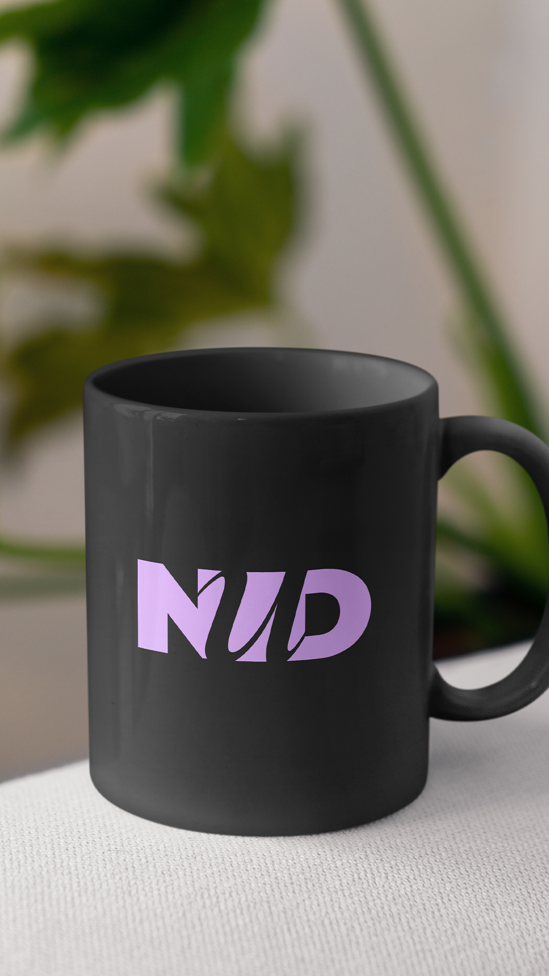
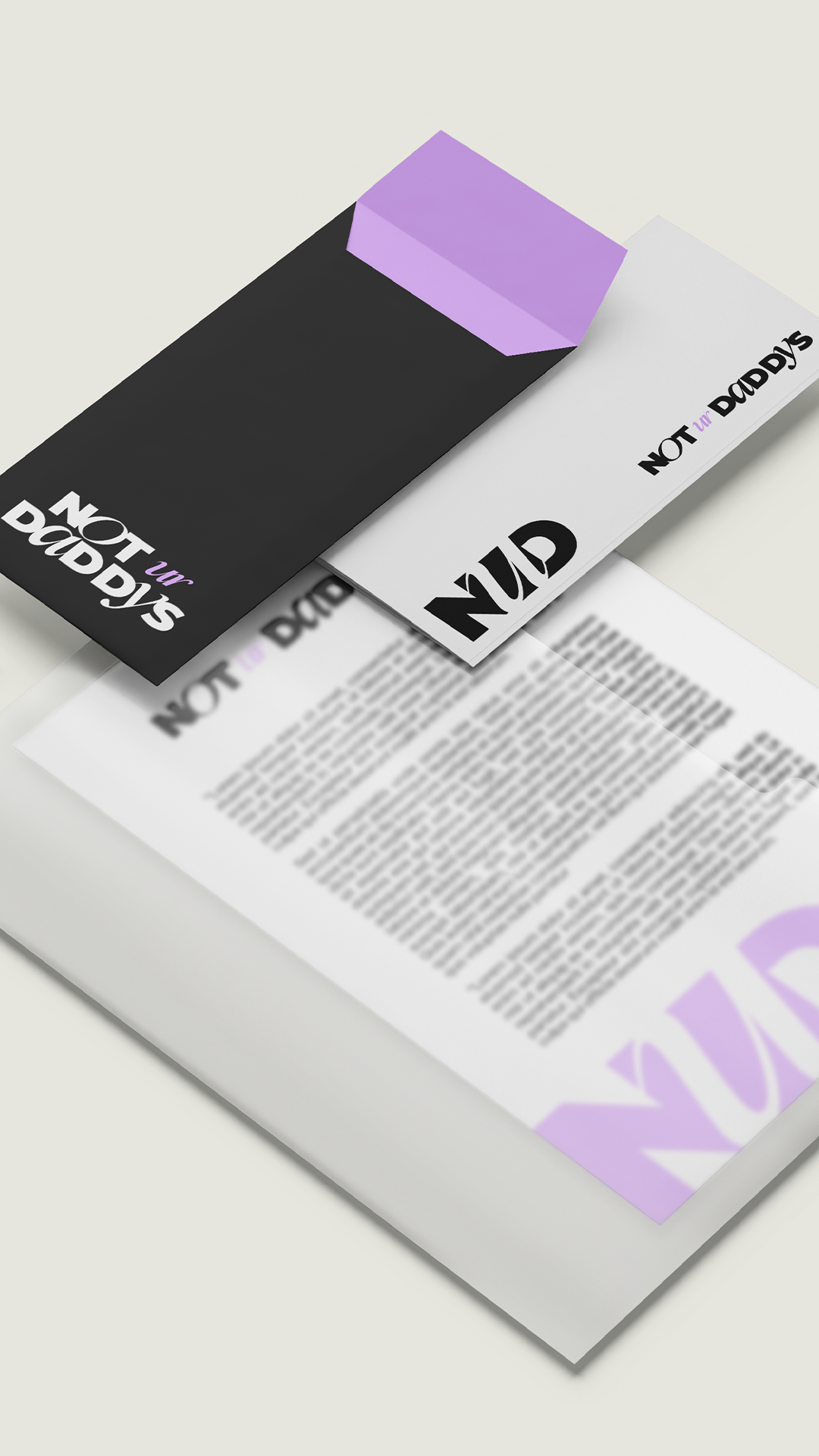
We threw out the mortgage industry playbook. No navy. No gold. No serif typography. No "Your Trusted Partner in Homeownership." The wordmark is the loudest thing in the room — chunky display type with a slanted italic ur cutting through the middle, more attitude than typography. The NUD monogram lives inside a neon ring, the kind of mark you'd expect on a cocktail bar door, not a lending business card. The palette runs deliberately tight: black, white, and a single shot of lavender that does all the personality work — confident without becoming aggressive, modern without being cold, hers without being predictable.
Every touchpoint reinforces what Theoni's audience already knew about her: she's a lender for people who don't want their financing to feel like financing — and she'd been telling them that on her phone, in her own voice, long before the brand caught up.