The Preserve on Winn is a new residential development in Maine. The brand had a hard brief: a project being built now needed to read like a name the land had carried for generations.
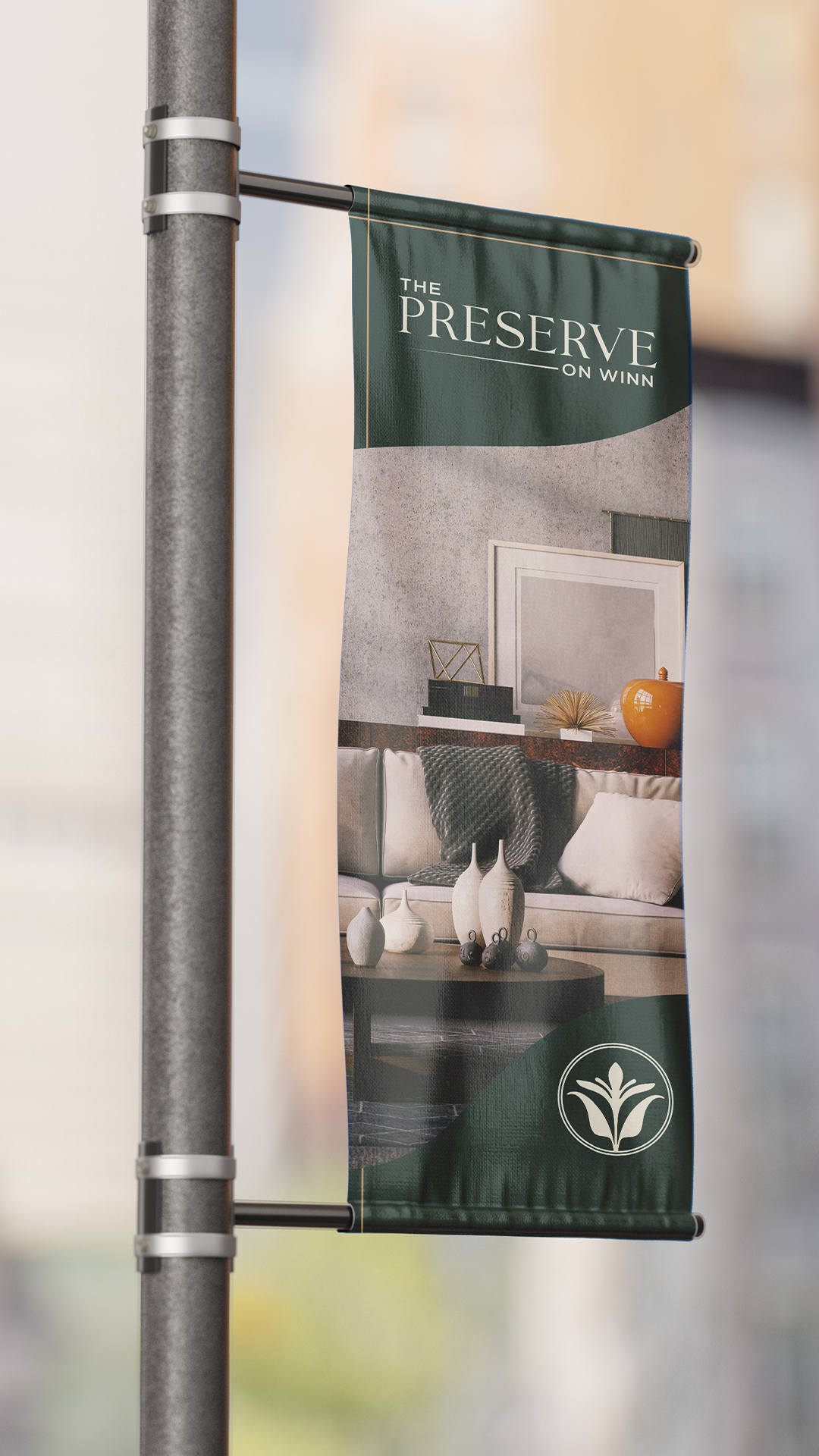
We built a visual identity that refuses the new-development playbook. No "coming soon" hoarding aesthetic. No generic luxury blue-and-gold. No marketing-deck modernism. The whole system reads more like an old field club than a development launch — closer to estate signage and regional field guides than listing brochures.
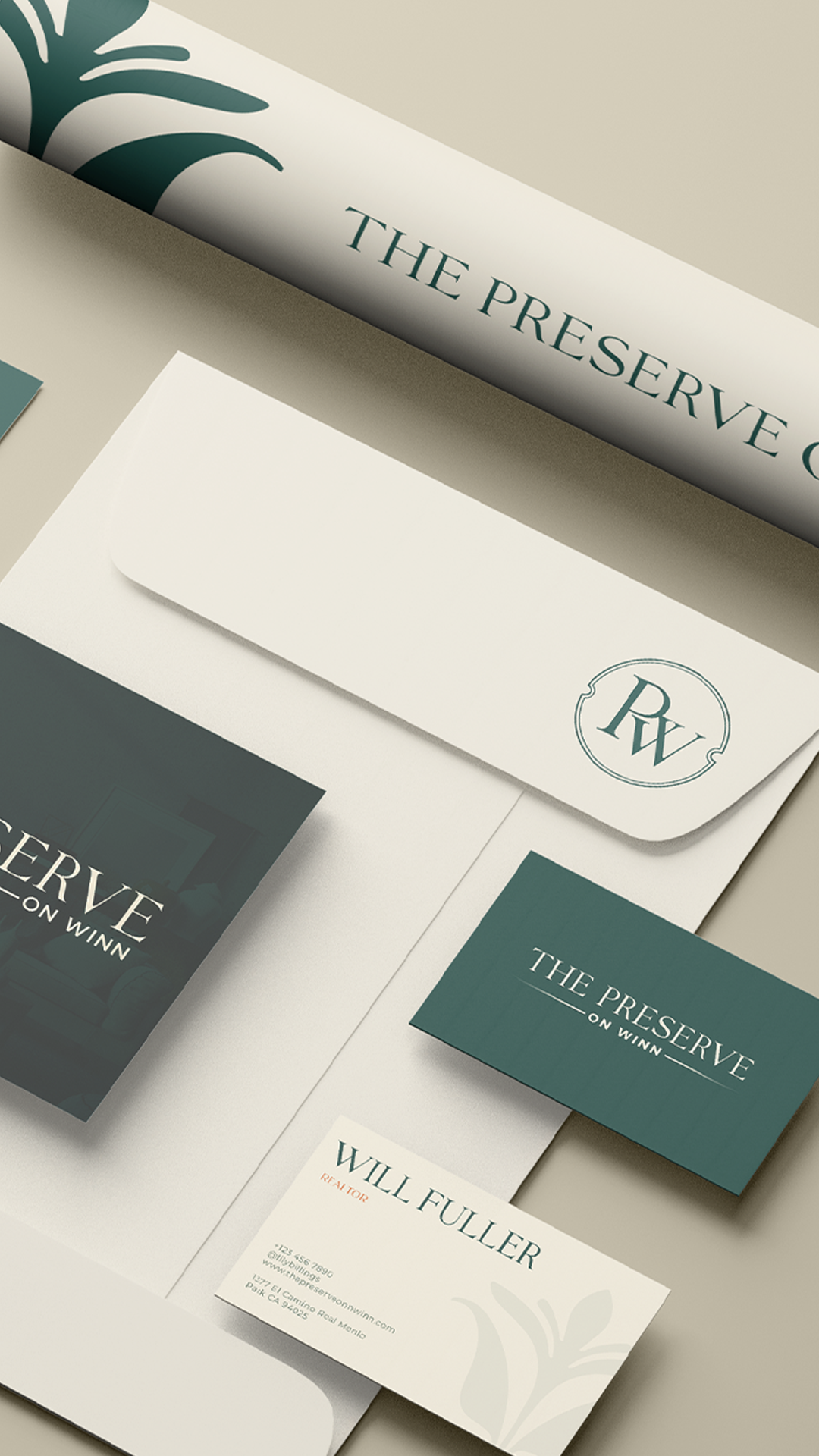
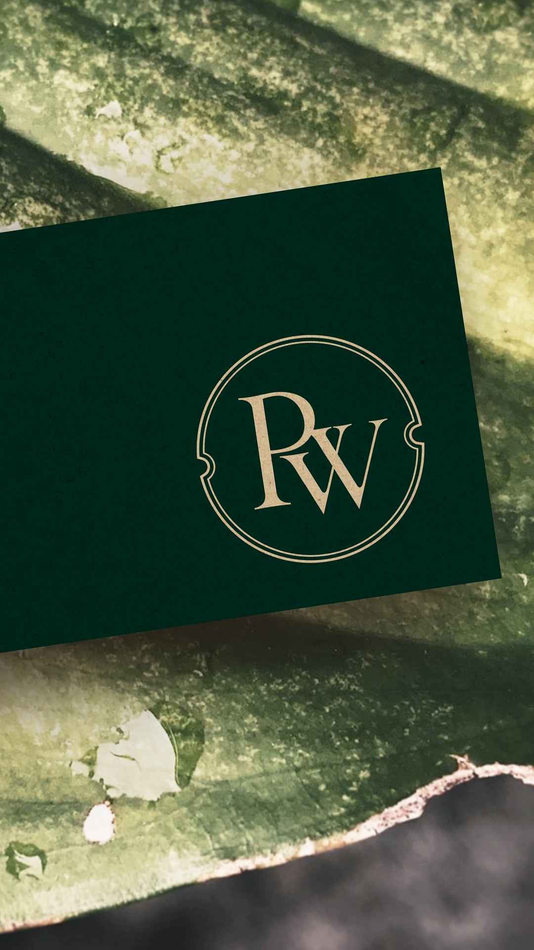
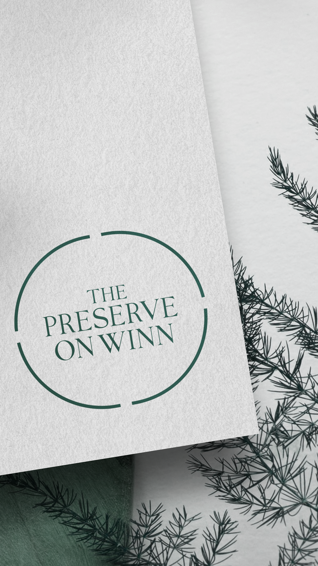
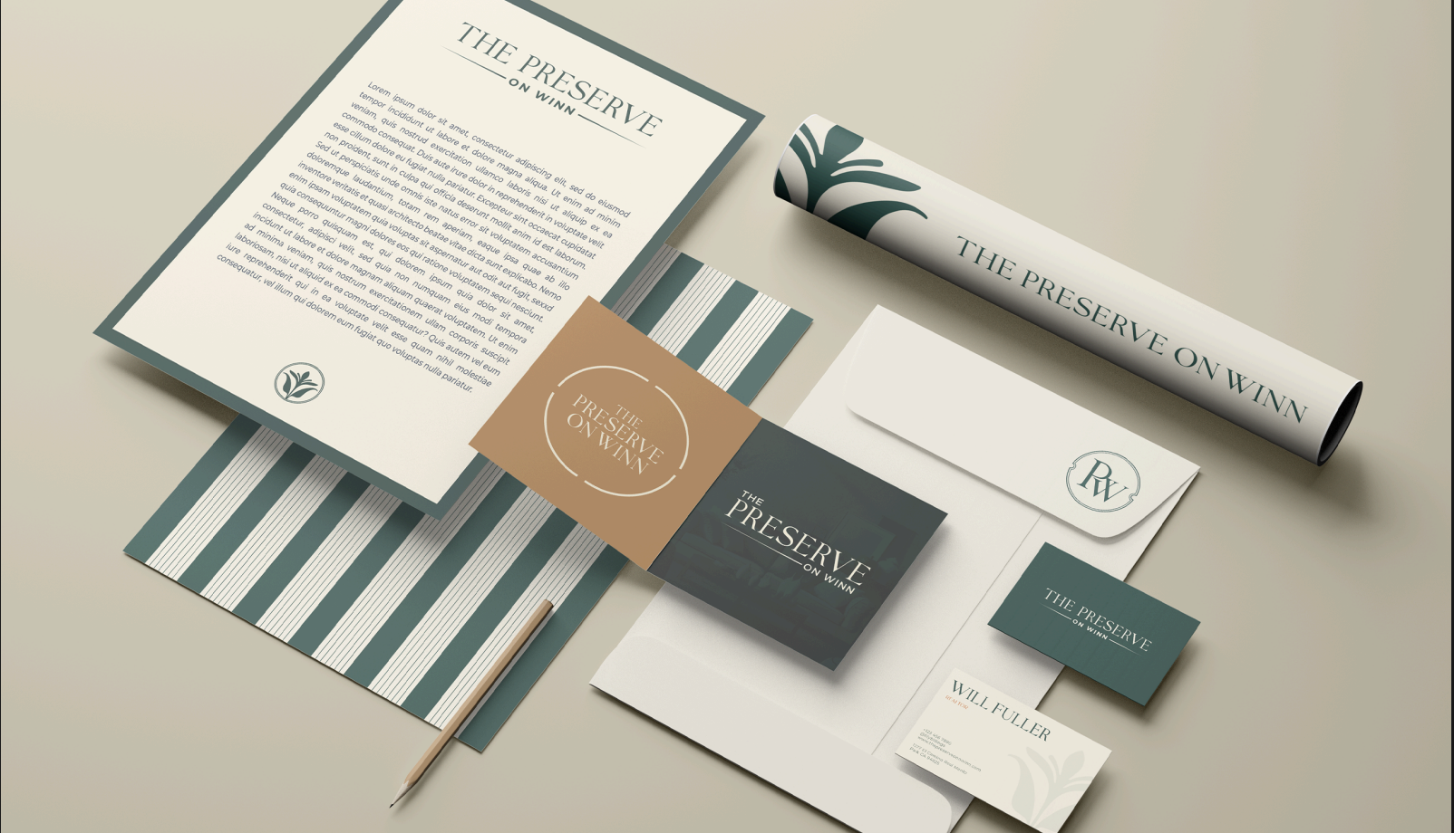
A serif wordmark with wide letterspacing anchors the identity, the kind of typography you'd expect carved into stone at a trailhead or pressed into the cover of a local history. The circular seal monogram around "THE PRESERVE ON WINN" is built like a maker's mark or club register — structural credibility rather than decorative flourish. A spruce-and-oat palette warmed by terracotta pulls directly from the place itself: old-growth pine, raw linen paper, the dried lichen on Maine granite. Stripe-pattern wrapping paper carries the system across surfaces with the quiet confidence of an old book's endpapers or the lining of a club tie box.
Every touchpoint reinforces what residents feel the moment they see the seal: this place has always been here.
Want me to tweak anything before you drop it in?