Petra Pavlic has Master's degrees in Finance and Economics, decades of international business experience, and a habit of gifting clients homemade cookies and unsolicited interior design tips. Her brand had to hold both.
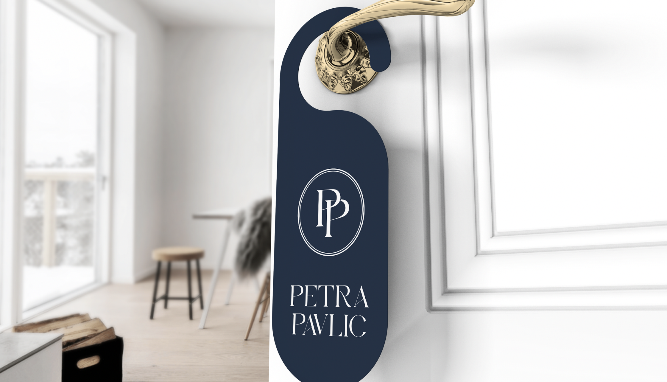
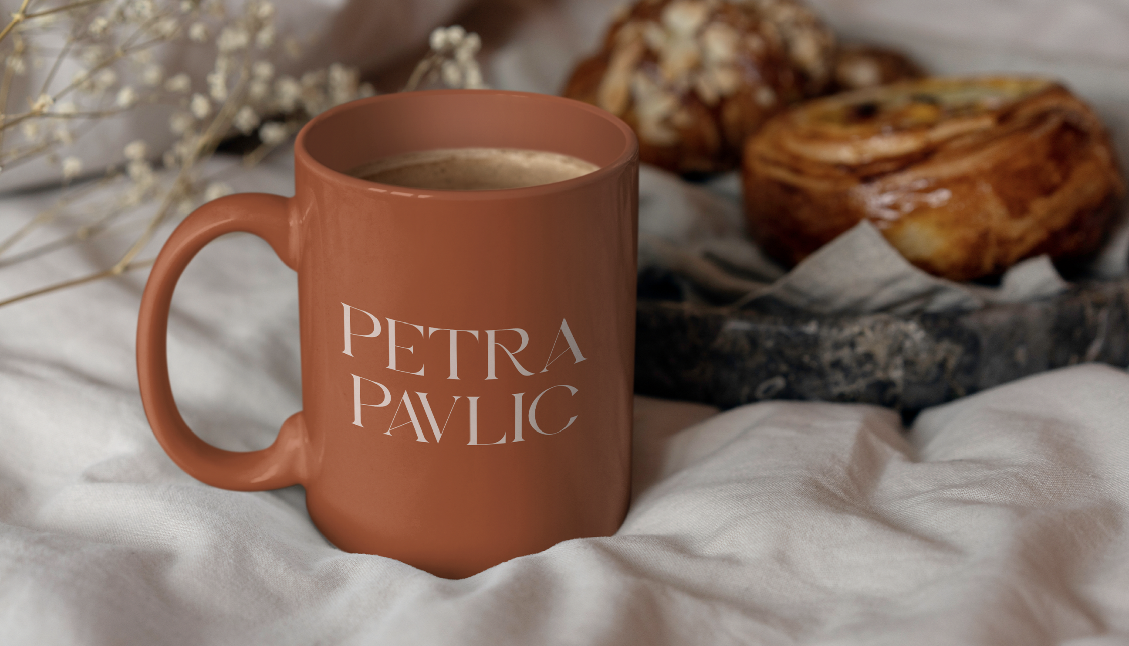
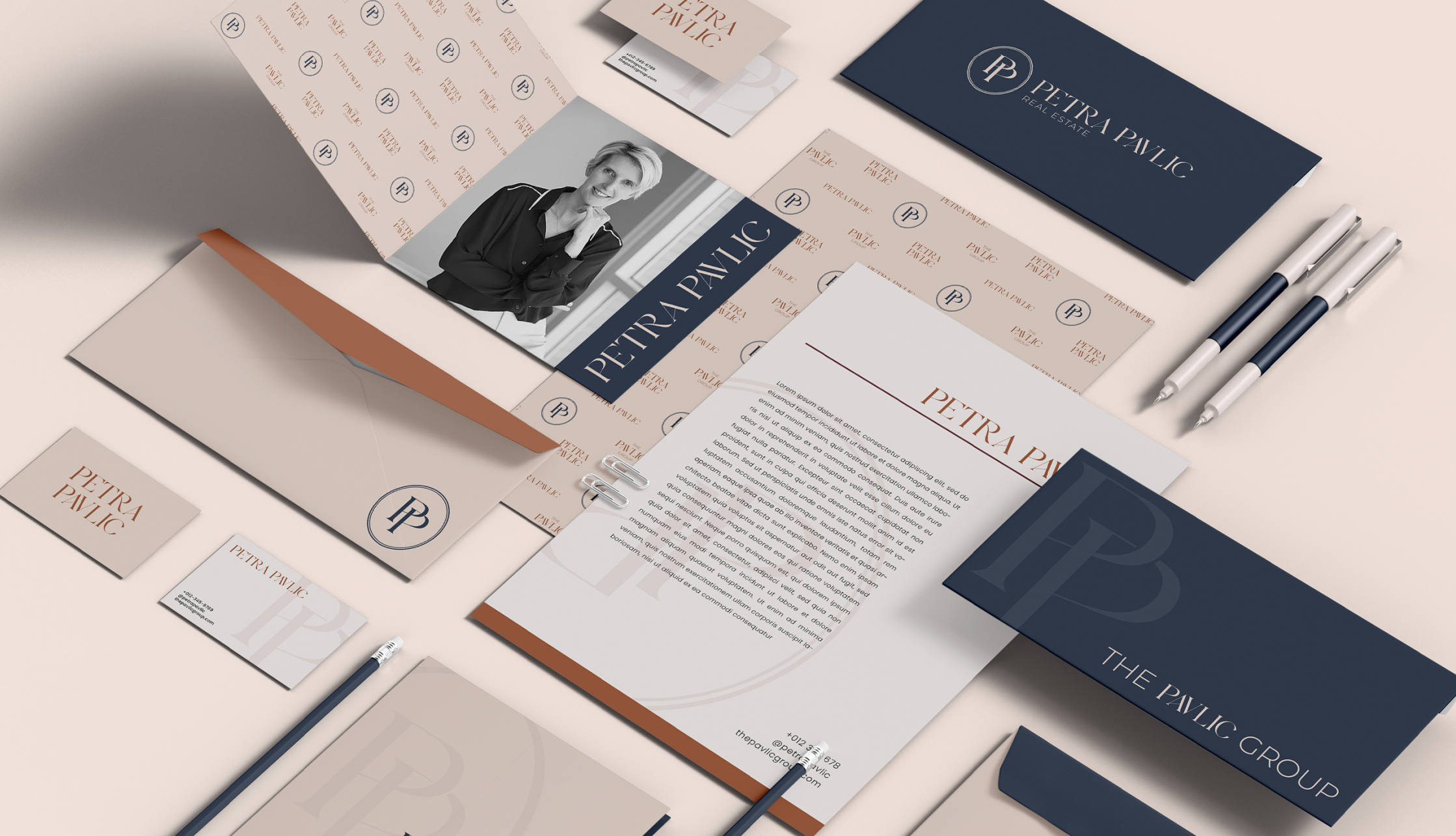
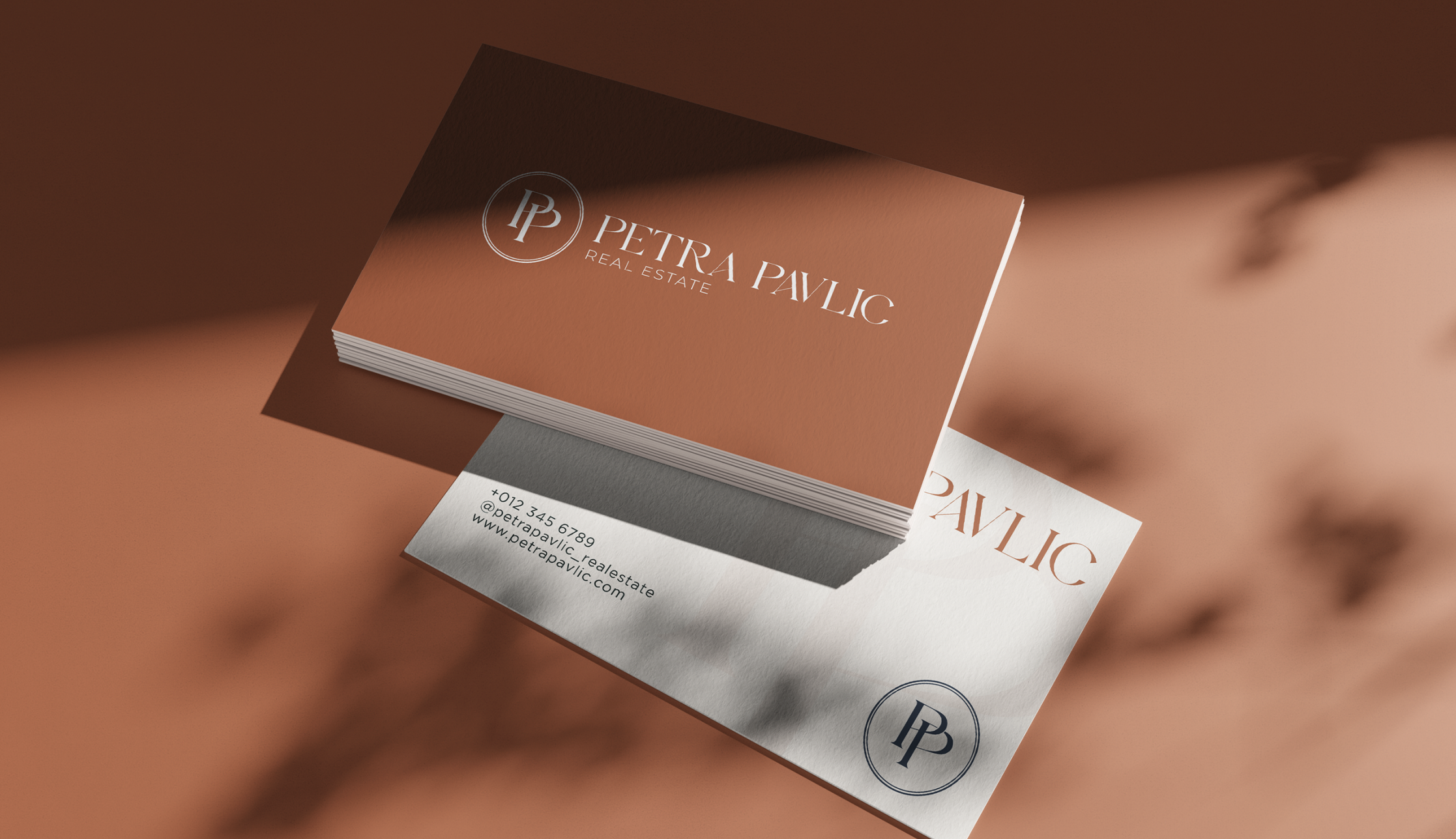
We built a visual identity that doesn't pick a side. Deep navy and a refined serif carry the seriousness Petra actually brings to a transaction. Warm terracotta and a soft brand pattern carry the rest of her: the host, the baker, the friend who reorganizes your living room while you're not looking. A monogram with interlocked PP letterforms lives inside an elegant oval, the kind of mark that looks like it belongs on personal stationery, not a brokerage business card.
The typography has weight without being stuffy, which makes sense for a broker who moved from Slovenia to Seattle to Indianapolis and operates inside @properties Christie's International. The terracotta pulls the brand back to warm, so Petra still feels like the broker who will spend three hours helping you pick the dining room paint color after closing.
Every touchpoint, from door hangers to business cards to client gifts, reinforces what her clients already know: she handles the contracts with the same care she handles the cookies.