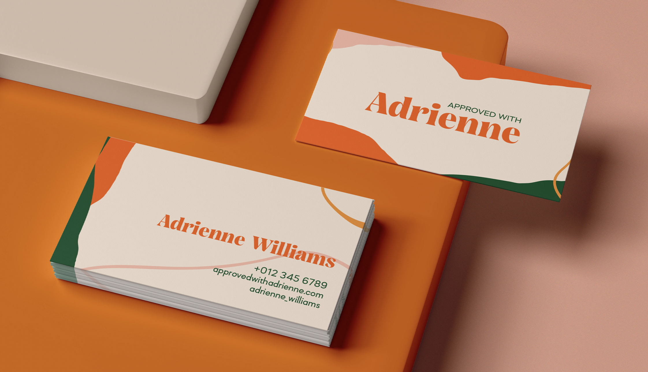
The name does the strategic work. Approved With Adrienne. Not Approved By. That one preposition is the whole positioning. Most clients arrive at the mortgage process already bracing for judgment, treating the lender like a gatekeeper to win over rather than a partner to walk in with. Adrienne Williams built her business to undo that dynamic. The brand had to make the with feel real on sight.
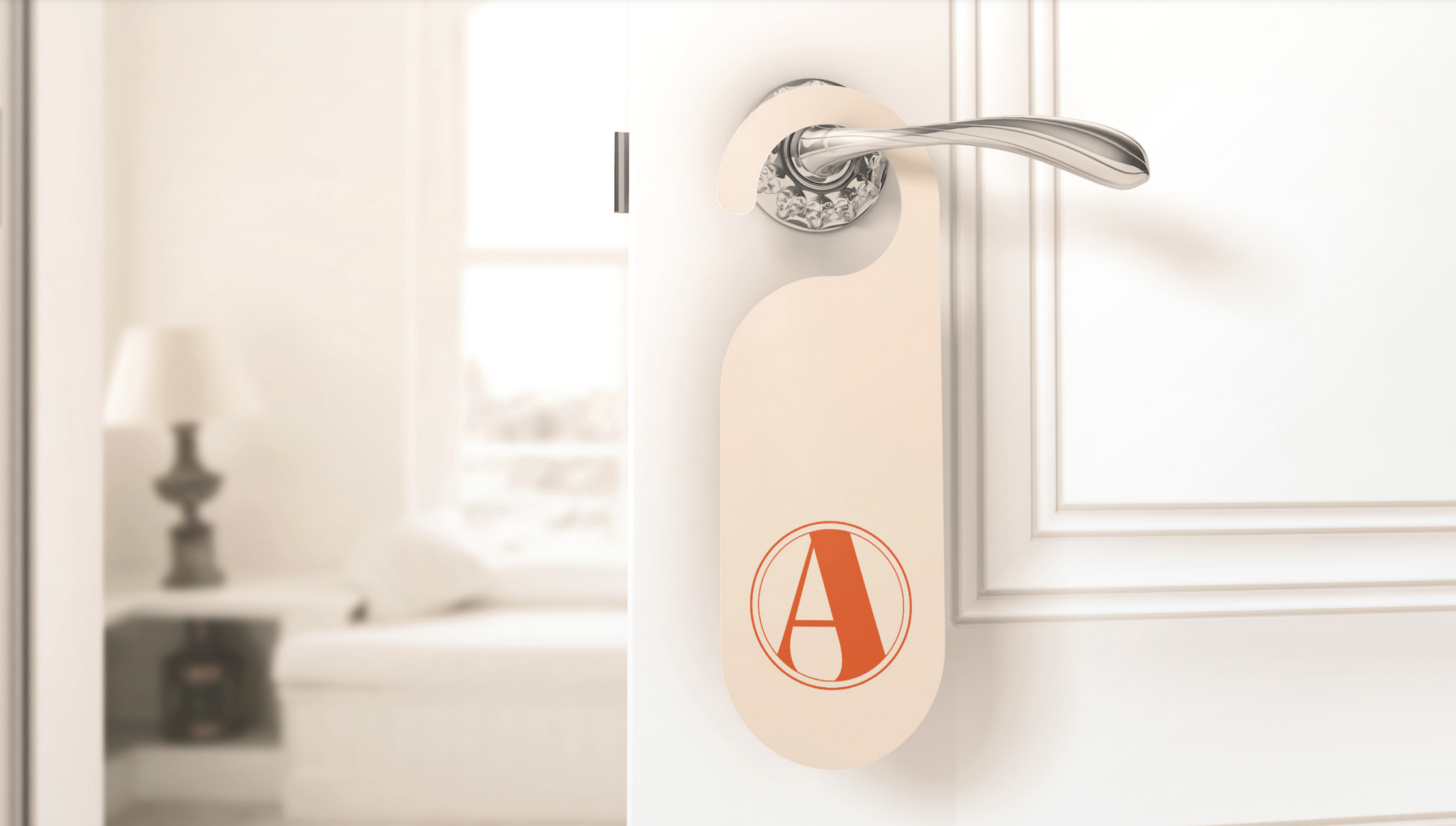
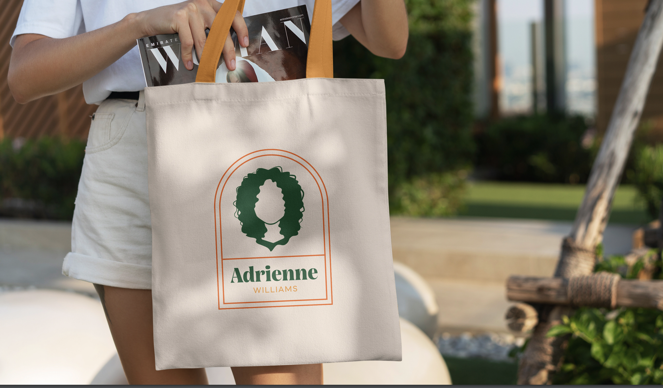
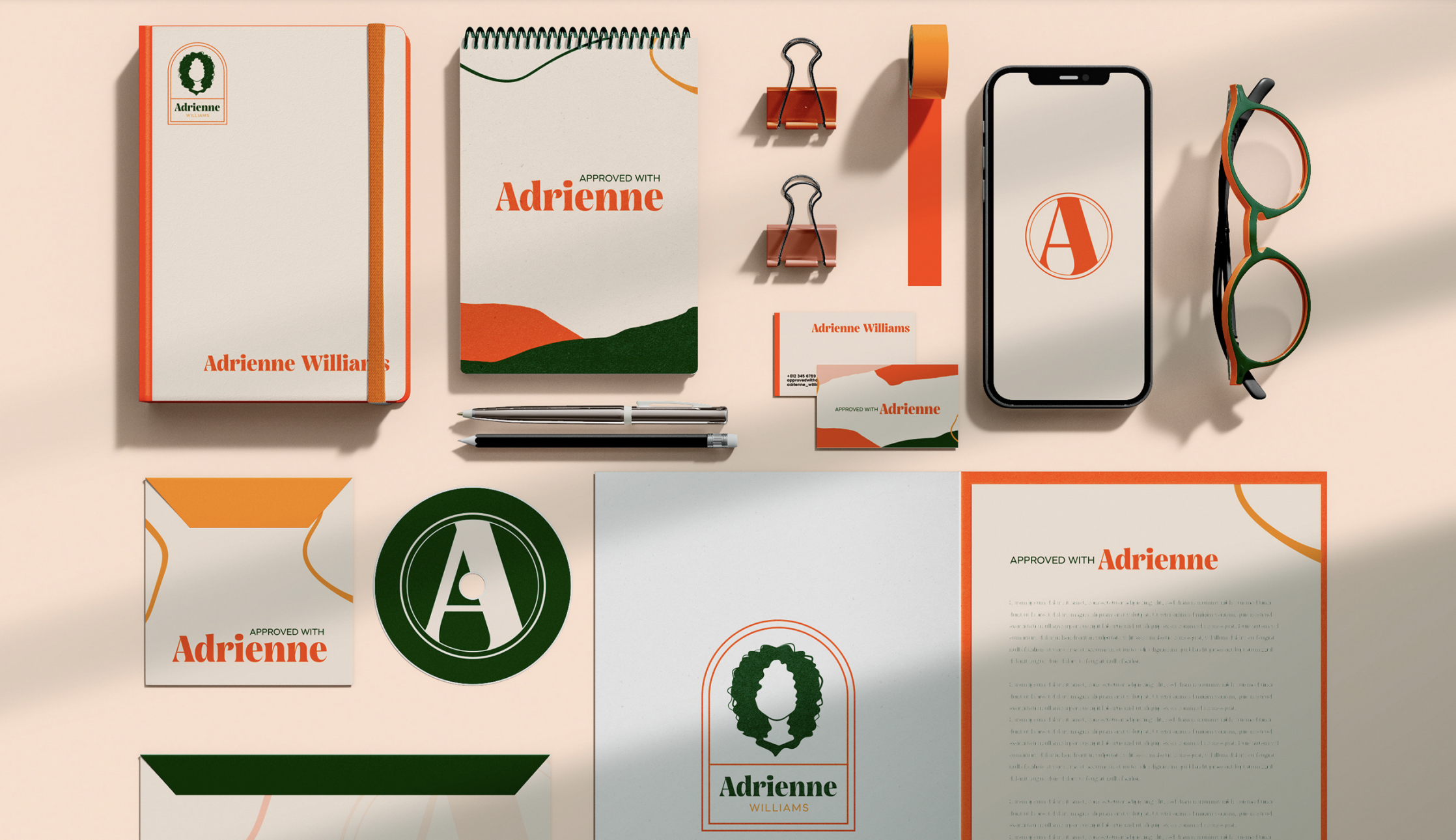
We built a visual identity that reads as a person, not an institution. Vibrant orange and forest green bring warmth and confidence to a process most clients dread. Organic wave shapes pull the brand away from the rigid grid of corporate lending. A bold A monogram works as a confident standalone mark across signage and digital, while a badge with an illustrated portrait gives the brand a face, exactly the opposite of the faceless lender experience.
Every touchpoint, from business cards to door hangers to social, reinforces what Adrienne actually offers her clients before they ever pick up the phone: a real person, on your side, who happens to handle loans.