Jason Cassity built The Cassity Team into one of San Diego's most respected teams and a name with national reach. The challenge for the rebrand wasn't introducing him to a new audience. It was making the brand finally match the reputation he'd already built.
That meant solving for two things that usually fight each other. The seriousness of a top-producing team that closes complex deals, and the warmth of someone you'd actually want sitting on your living room couch. Approachable luxury, the way he and his team already operate.
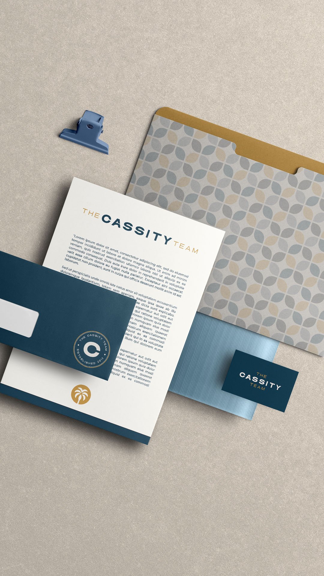
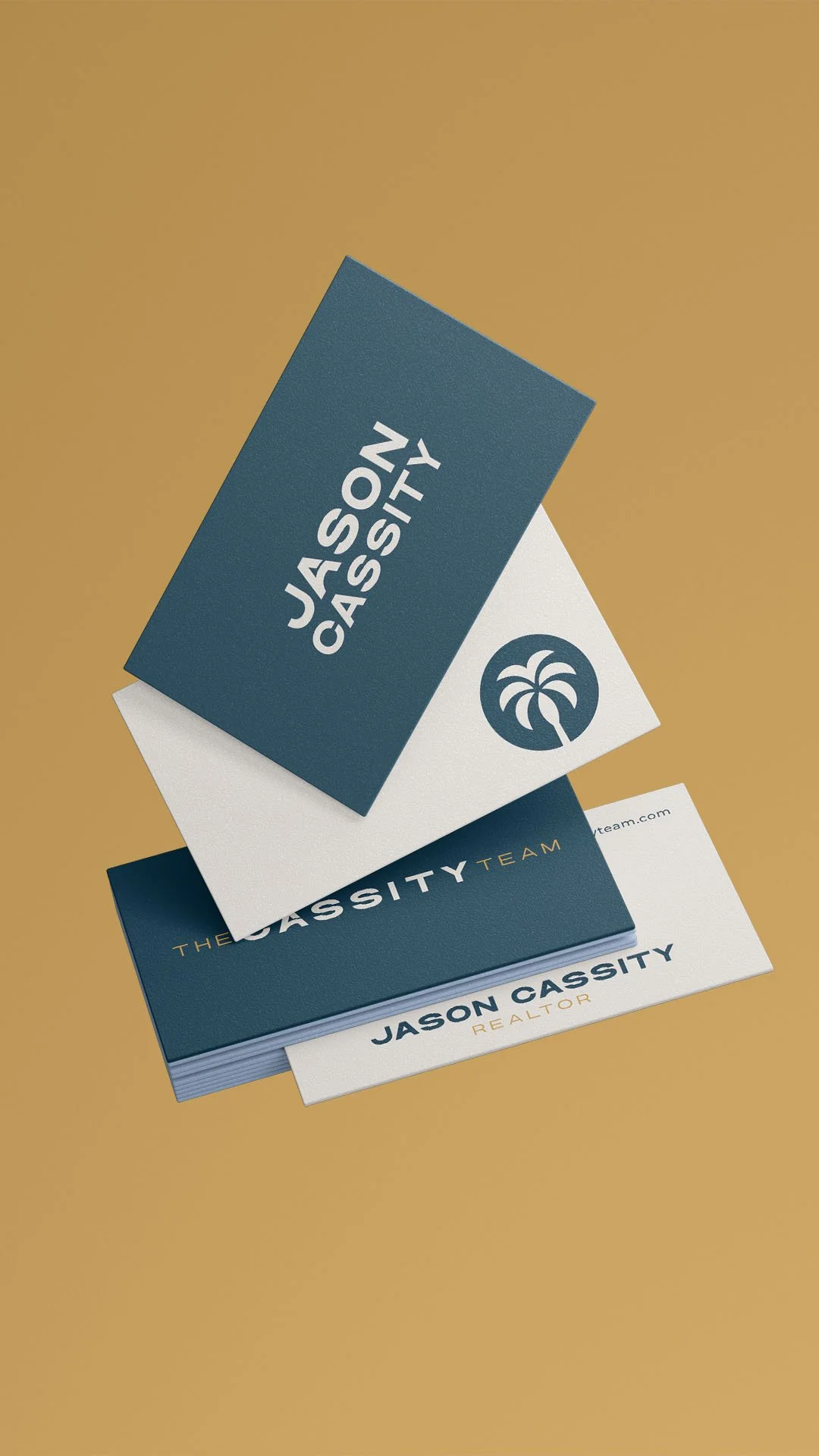
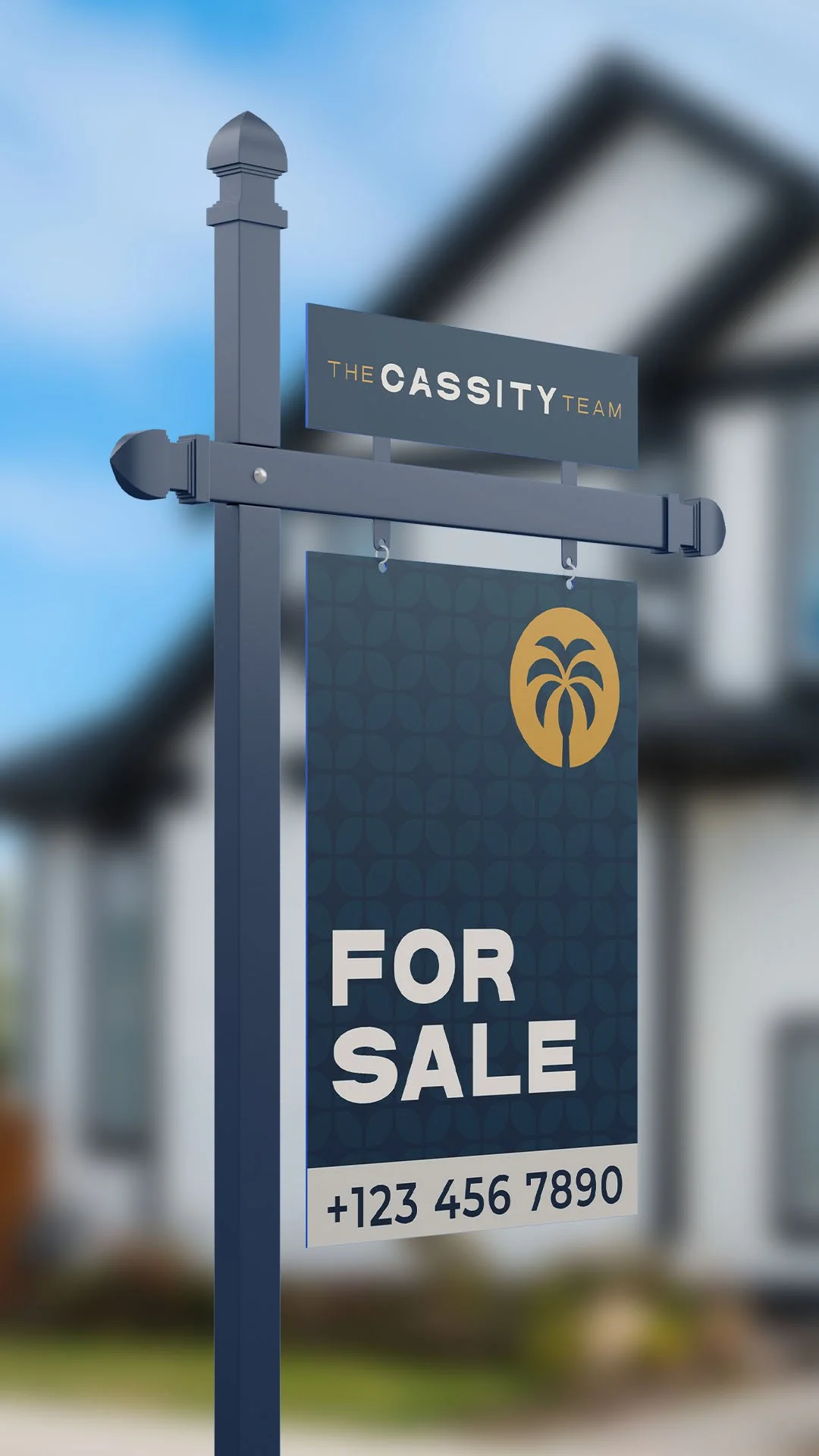
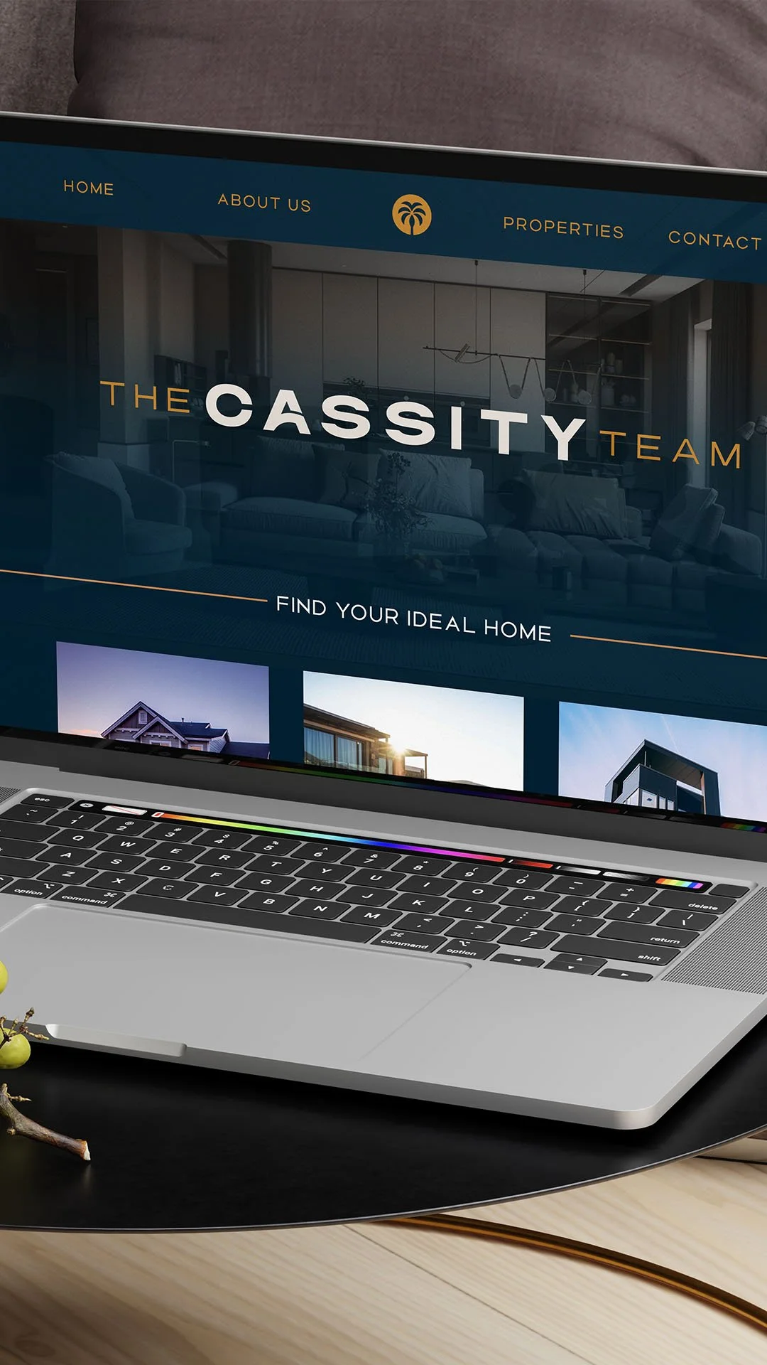
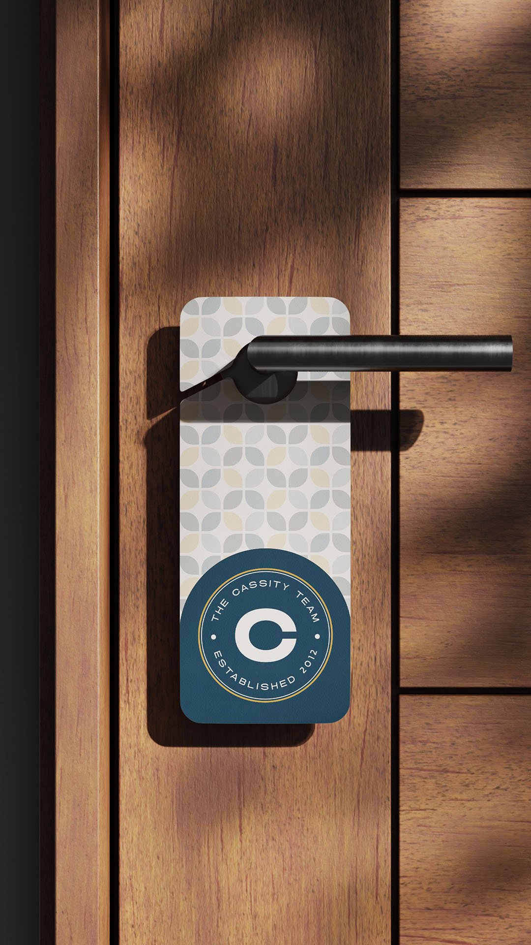
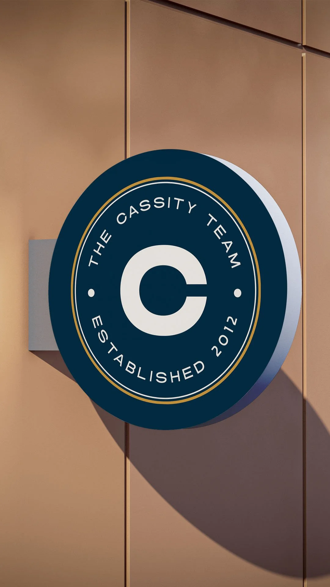
We built a visual identity that holds both. A deep teal works in a richer register than navy, holding sophistication without slipping into a generic luxury default. Warm gold balances the teal's depth, carrying the approachability that black-and-gold luxury defaults can't. The palm icon gets a graphic, almost crest-like treatment that reads San Diego without leaning on the postcard-beach version of the city that every other coastal market uses. The geometric tile pattern pulls from the city's actual architectural language (mid-century, Spanish revival) instead of generic coastal cliché.
Every touchpoint, from yard signage to stationery to web, reinforces what Jason's existing clients already know about him: serious team, approachable human. The brand now walks in the room the way he does.