THE StoryMost keynote speakers default to one of two looks. Corporate-stiff: suits, neutrals, branding that confuses severity for credibility. Or generic personal-brand pastels that blur together in the algorithm.
Chelsea Peitz built her business on a different premise: you don't have to choose between being taken seriously and being fully yourself. Her brand had to make that the first thing you saw.
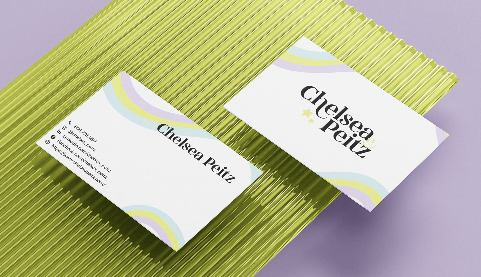
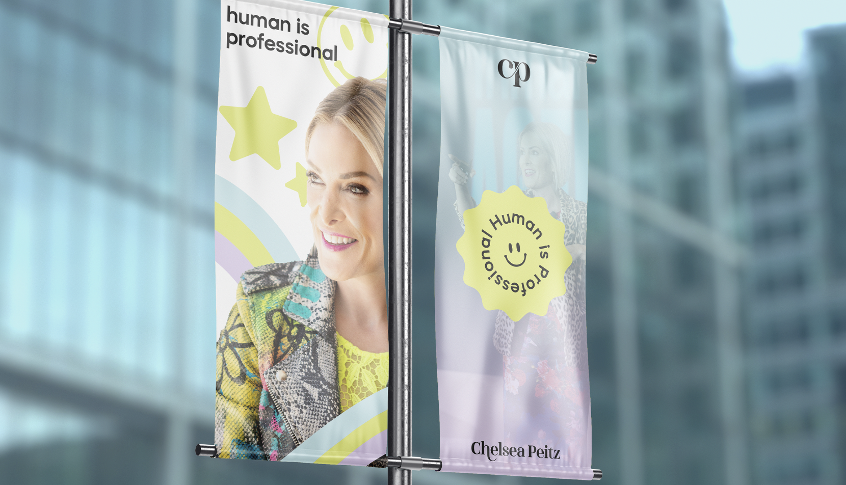
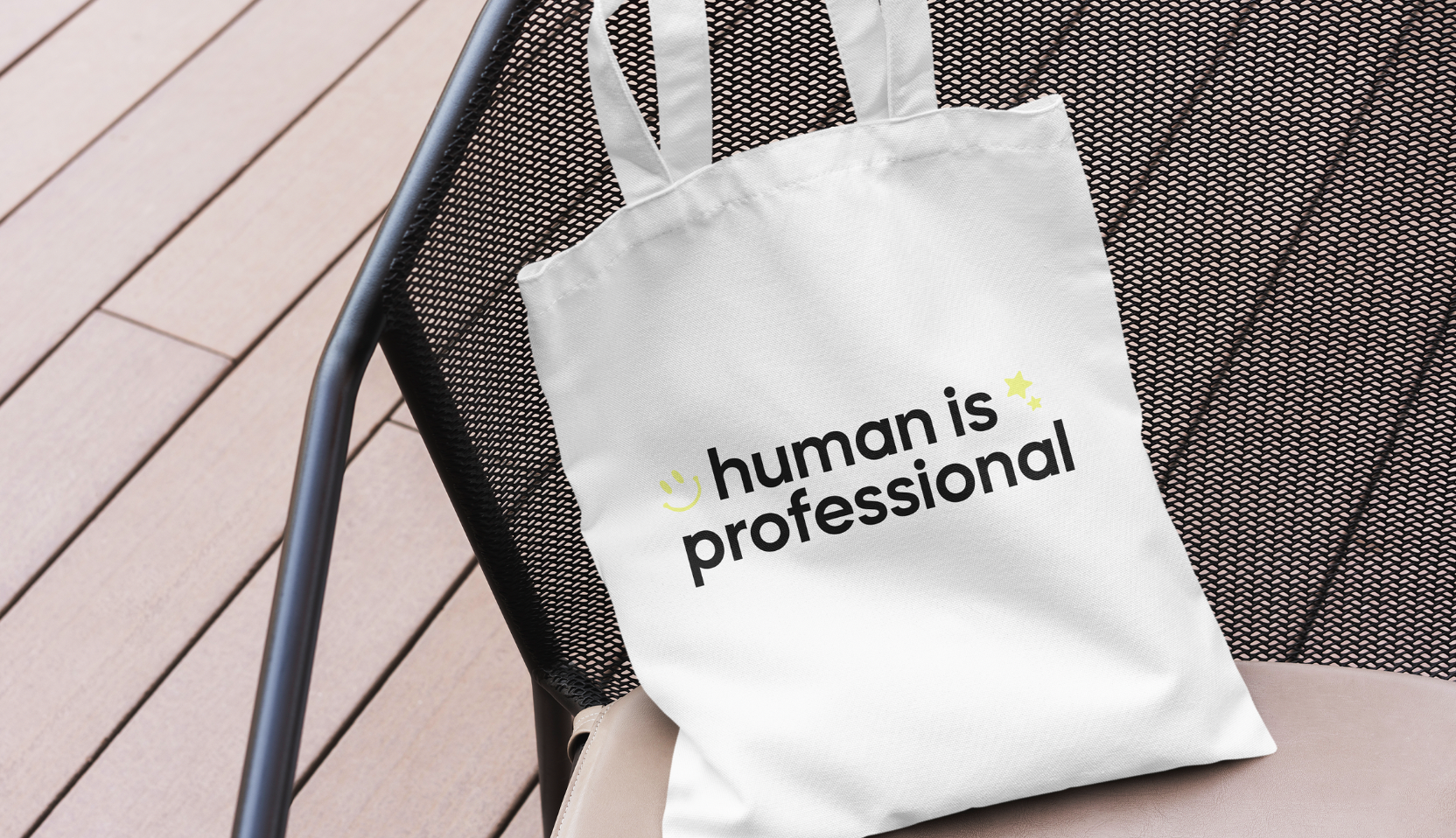
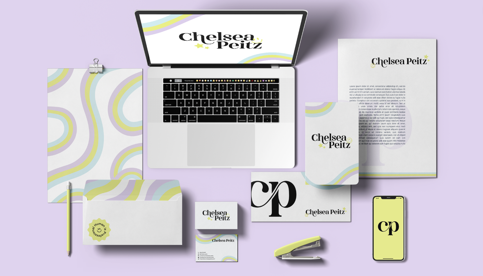
We translated her positioning into a visual identity that refuses both defaults. Lavender, lime, and pastel rainbow accents carry the energy she actually brings to a stage. The smiley brandmark turns "human is professional" into a glanceable thesis. The wordmark reads warm and confident in the same breath, the way Chelsea shows up in front of a room.
Every touchpoint, from business cards to street banners to merch, was built so her audience recognizes her on sight. Not because the brand is louder, but because it's clearer about what she actually believes.