Candace Hollon leads Hollon Home Group in Colorado Springs, a market where most real estate brands serving military families lean hard on the obvious symbols: eagles, dog tags, red-white-blue palettes, "veteran owned" badges stacked across every touchpoint. As a veteran herself, Candace knew her clients didn't need the visuals to prove the credibility. They needed the brand to focus on what they were actually moving toward.
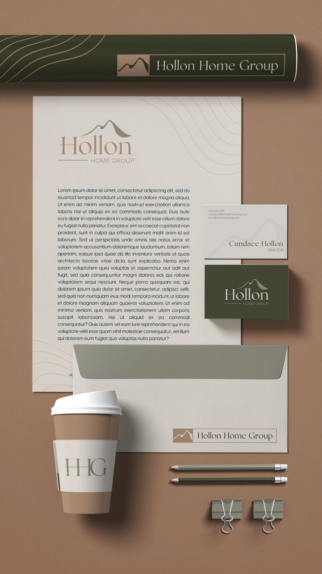
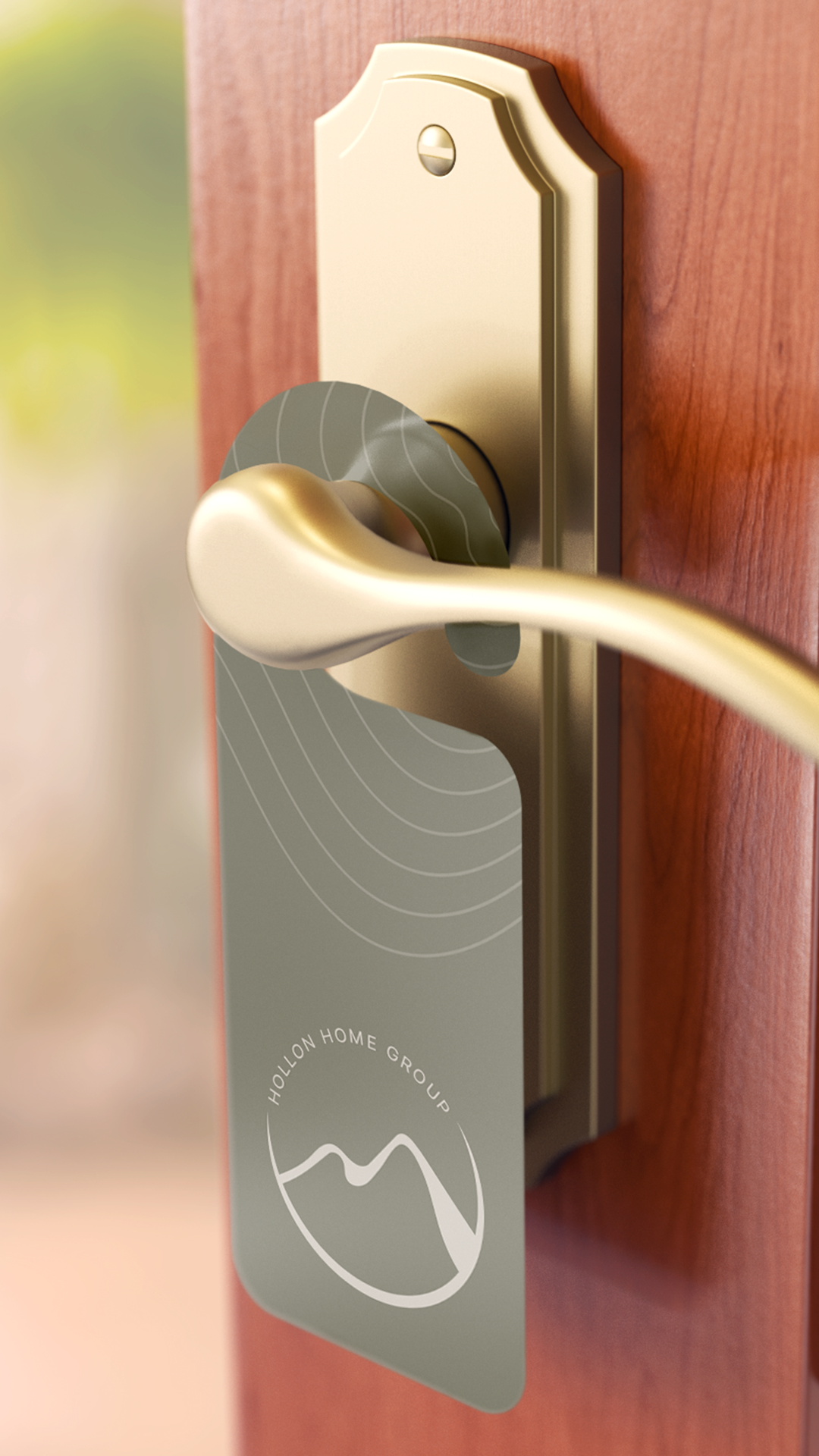
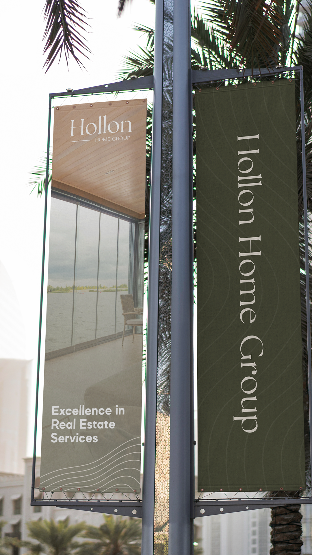
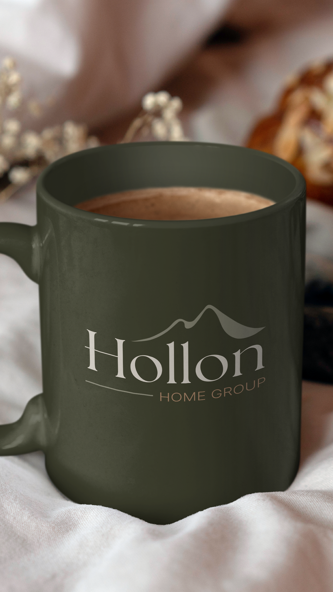
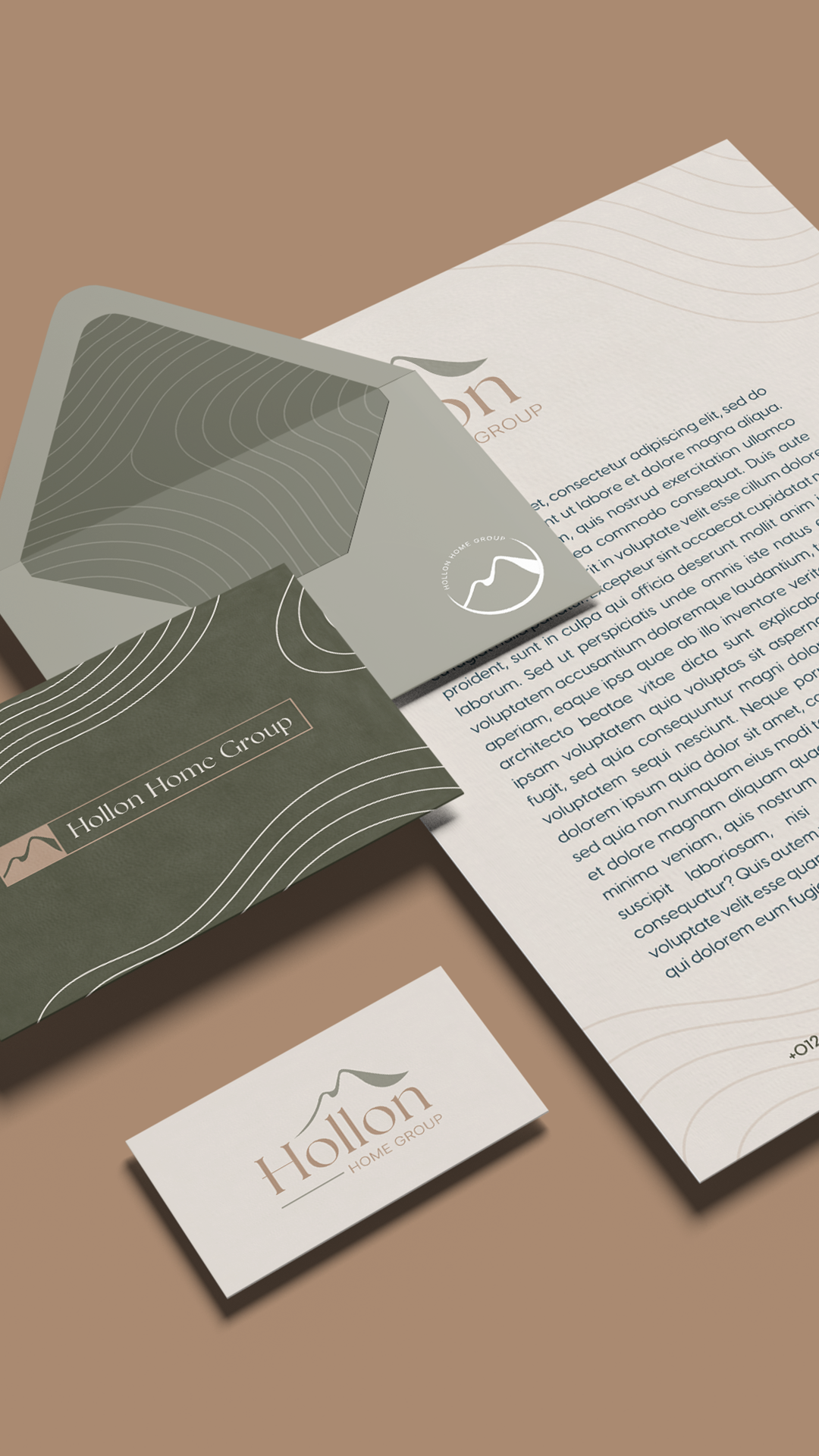
So we built the brand around home, not just the next address. Sage green and warm earth tones pull from the kind of Colorado morning where you can finally exhale. The mountain mark reads less like a Pikes Peak postcard and more like the view they'll eventually take for granted from the back porch. Topographical lines reference both Colorado geography and the long journey of relocating somewhere new.
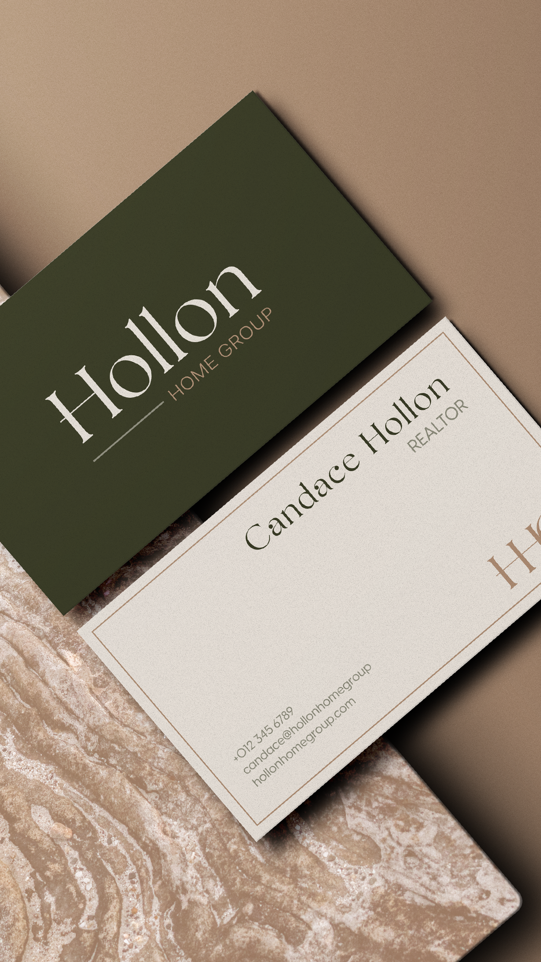
The typography reads warm and refined, not procedural. Hollon as a wordmark sits closer to a boutique residential brand than a transactional real estate agency. That choice matters for the audience: military clients are often moving for the third, fifth, tenth time. The brand needed to feel like they were finally landing somewhere, not signing another set of orders.
Candace's veteran status shows up in the trust her clients put in her, not in the logo. The brand makes room for the rest of her story.